When I first started working with Lisa her kitchen had the bland, generic look that was (and still is in some cases) so common in new homes. Not much in the way of personality, but when a young family is moving into their new home many times there just isn’t a lot of money for upgrades and beautiful detail work.
Phase 1
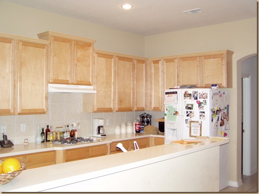
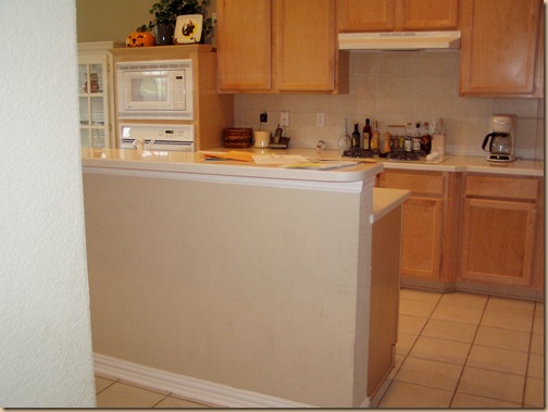
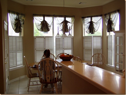
So it was light beige walls, light beige countertops, light beige back splash, light beige floor tiles and plain light golden oak stained cabinets. Generic colors that didn’t limit her as far as adding color in her accessories, but also didn’t contribute much in the way of personality to the space either.
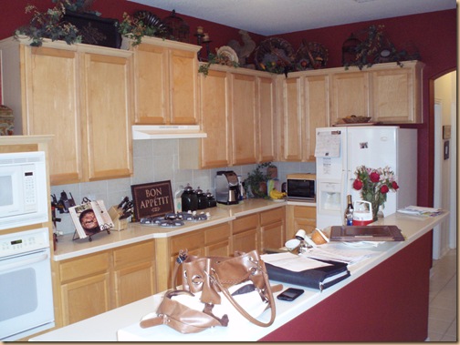
So years ago she called me to do some re-decorating in other parts of the house and help ramp things up a notch in the kitchen, but on a very limited budget. To cozy up the space I had the kitchen painted red and added some interesting accessories to the top of the cabinets and countertop. Not a lot – just a little touch to cozy up the space.
Phase 2
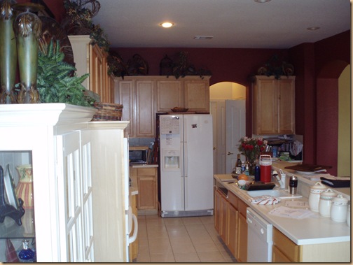
Pardon all the junk on the countertops! – I didn’t actually take these pictures until I went back to completely gut and remodel the kitchen entirely so it’s not exactly “staged”. But this is basically what it looked like for a few years (minus my purse, portfolio, papers and junk!) – just a bit warmer with color and accessories, until they could afford to really get the kitchen of their dreams.
As they (and their children) got older they toyed with the idea of moving into a bigger, newer home and spent considerable time looking around. In the end they decided they really liked their house and their neighborhood and made the decision to stay put.
They were now in a position financially to really make some serious changes. And with David, her hubby, currently going back to school to be a chef (wives out there – can you imagine how wonderful that would be?!!) – a state of the art kitchen was definitely in order.
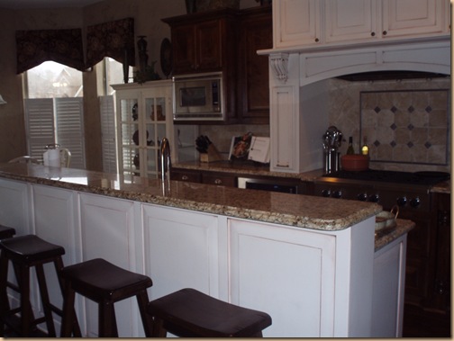
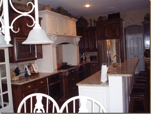
So out went the boring cabinets, the boring back splash, the boring countertops and the boring floor. In came a state of the art “chef’s” six burner stove and oven, surrounded by this beautiful cabinetry, Santa Cecilia granite, tumbled stone back splash with metal accents, and hardwood floors. We extended the depth of the upper countertop in order to add an eating area for the kiddo’s with these saddle seat bar stools.
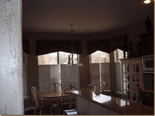
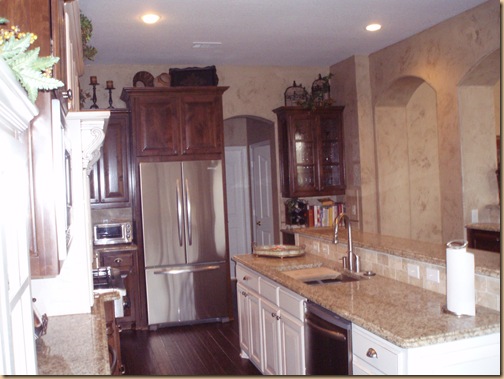
The red walls gave way to textured walls with a faux finish in paint and glaze. New updated window treatments replaced the old. (Sorry you can’t see them very well. They are beautiful.)
I had them combine two stain colors, the cream and the dark stain to create interest and make their incredible cook top area stand out as it should. All new hardware was added to the cabinets.
Stainless steel appliances replaced the old white ones and rich gorgeous hard wood floors replaced the insignificant beige tiles. I recycled some of the old accessories and incorporated some new ones for the cabinet tops.
After years of waiting this precious family finally has the kitchen of their dreams, fit for a king and perfectly suited for a “chef”.
So much fun!
Happy Decorating!
