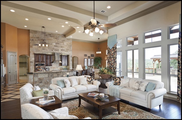
It’s time to freshen up the house with a more updated look, right? You’ve had the same color of red and gold for ten years and it’s feeling a bit drab. But, what to do? How do you select a fresh new paint that you’ll be happy with for the next ten years or so.
It’s not like you can just get all new furniture in one sweep (or, I don’t know…..maybe you can), but you just know the paint is driving you crazy and it has to go…..now.
Well, if you’re like many people you are looking to tone things down a notch with a more neutral palette. Or at the very least…..a softer palette.
Take a look at some of these tried and true color combinations that might suit you:
Here’s a color combination you might want to think about: Sherwin Williams Balanced Beige walls and Westhighland white trim. These two colors together offer a neutral palette that will give you a clean, crisp look with the warm beige on the walls and this bright, (but warm) color for the trim. And these paint colors should work with most any color you’d like to incorporate in your home.
These two colors above, used together, are one of my favorite paint color combinations and I’ve used them a number of times. A bit warmer in tone than the Balanced Beige shown previously – the Latte is very soothing, warm and welcoming; paired with the Divine White trim it also provides that clean, crisp neutral look without being boring. It’s beautiful enough to make a statement and yet, subtle enough to feel restful and uncomplicated. (Which is always a bonus.)
Grays and “griege’s” are all the rage right now so if you prefer to go that direction you might consider Sherwin Williams Dorian Gray and Snowbound White below. I’m using these on one of my projects now.
This provides the same clean, crisp look as the beiges above, but it takes you into the slightly gray-ish tones while remaining more of a beigey-gray. The Snowbound trim provides a nice stark contrast to the Dorian Gray and lends itself to a “transitional vibe” although this could easily go with a more traditional look as well.
Another “greige” option might be Sherwin Williams Perfect Greige:
Paired with Snowbound shown above or Heron Plume shown below:
Or there’s always Sherwin Williams Mega Greige below with Extra White trim:
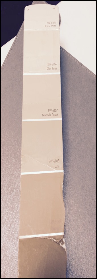
If you look at this strip below (from my very worn fan deck) of paint colors you can see that the Latte is smack dab in the middle of the strip. That tends to be the range of color (no matter what color palette) I like to use for walls. So if you were to pick up a fan deck and look up any of the colors listed above you’ll see they are all in the middle of the color range.
Some people are afraid that range is too dark, but that tends not to be the case. However, if you want to stay a bit lighter – simply move up the strip and give those lighter colors a try. I’ve used Nomadic Desert and Kilm Beige countless times as well. (If you look at the top of the strip you’ll see Divine White which is the color I suggested for the trim with the Latte shown previously.)
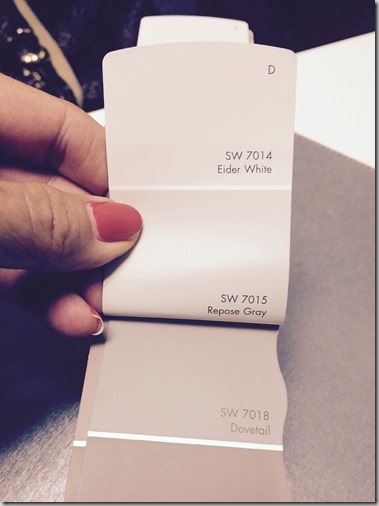
Just as shown with the Latte and the Divine White, an easy way to choose a trim color to go with the wall paint is to move up or down the strip for a perfect color that will compliment, not compete with the wall color. The important thing to note here is that you need to select a color that is at least TWO shades lighter or darker than your wall color in order to make enough of a contrasting statement. In the above example I’ve actually paired the Dovetail with Repose Gray which would actually be three shades difference. You can see that it’s a nice coordinating, but clean contrast. It’s a safe way for you to select colors that work together rather than pulling from another strip and worrying about whether or not they “jive”. Of course, as designers we do it all the time, and certainly if you’re comfortable you can do it yourself. This is just a little tip for safety and comfort if you’re feeling nervous about making the wrong selection.
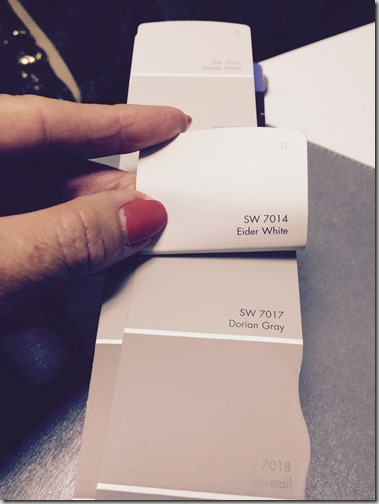
Here is another example. While in my own project I’m pairing Dorian Gray with Snowbound White (from a separate strip), here you can see if you simply move up the fan deck to the top it looks great with the Eider White shown at the top of the strip. Perfect match. You can’t go wrong.
If you have a space where you want to stay soft and subtle, but would like to bring in some color here’s a couple of options for you to consider:
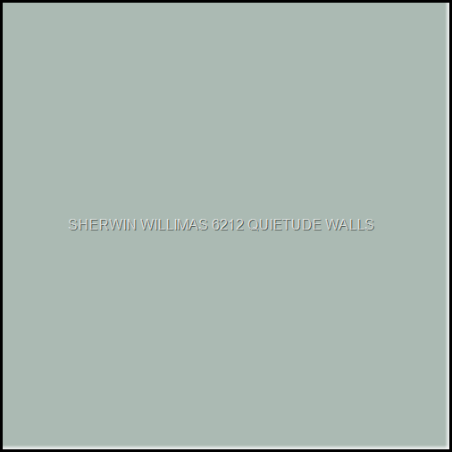
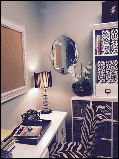
This color called “Quietude” works with any of the whites for trim shown above. A clean, classic, soothing color – this is what I have in my commercial office.
Hard to tell clearly from this picture, but I find it a very peaceful color. And, what workplace can’t use a little more “peaceful”?
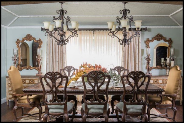
Here it is again in a client’s dining room.
Another color I like is called “Meditative” (do you see a pattern in the names here – Quietude and Meditative? – I think that indicates something crying out from my inner soul that I’m searching for!) Anyway, (Lol) it’s a beautiful color and looks good with any of the white trims shown above.
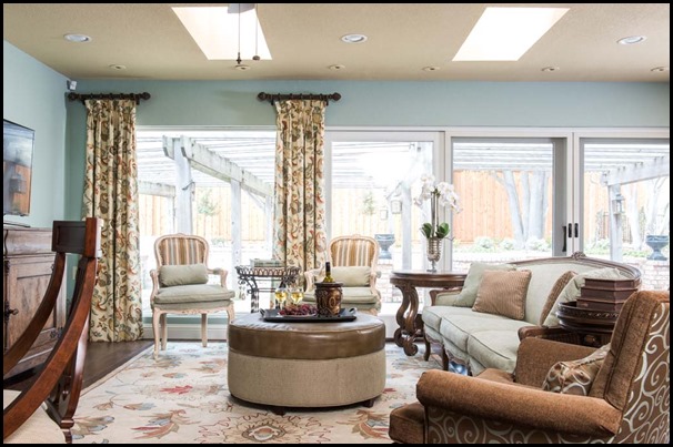
Here it is in a client’s living room.
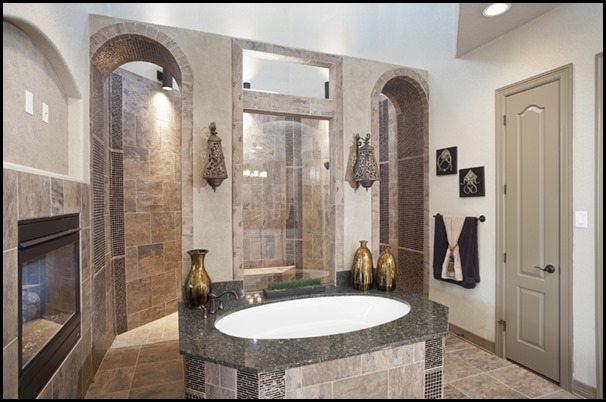
Now, you can also reverse the paint and trim by putting a lighter color on the walls and a darker color on the trim as shown in this bathroom. This is a model home I did in New Braunfels with another designer. It just gives it a different spin and is a fun option to consider.
Here it is again – reversed – in the family room of the same model.
Of course there are a multitude of colors out there to select from – by Sherwin Williams as well as other vendors. These are just a few ideas that I like that might work for you.
The only other tip I have for you today is to be sure and try out the paint color first BEFORE you slap it all over the walls! Paint color is a fickle beast and so many things will affect the way it looks in your home. Lighting, other elements in your home, etc. all play a part in how the paint will look. And it can look different from one room to the next.
So I would suggest buying small paint samples of the colors you are interested in (they’re in small containers for around $6.00) and a packet or two of half-sized poster boards and painting them in the color options you’ve narrowed it down to. Next – tack them on different walls at different times of day to see how you like the color. Then you can select the color and feel comfortable with it (rather than wait until an entire room is done and have a heart attack from disappointment).
So BE SURE to take your time selecting the right color and then go for it with gusto and enjoy a fresh new look for your home.
(And, after you done painting you’ll probably want to burn all your old furniture and start over with that, too. But, that’s another blog post!)
Happy Decorating!
