I’m currently working on a “Farmhouse Meets Hill Country” project and I must say it’s been a fun challenge to so far. We’ve been able to marry “his” and “her” styles quite seamlessly in a way that appeals to them both – his being more Hill Country and hers being more Farmhouse – .
They are both very visual so they felt my full design package was needed which includes a 3D virtual tour and 3D color renderings. This enabled them to see the many different looks and personalities their space could take on depending on the materials, floor plan and details. So I showed them five different looks to choose from ranging from Modern Farmhouse to Traditional Hill Country.
Their house is an older ranch style home with the kitchen separated from the family room. It’s located on around 40 acres with horses, a barn, a large pond, cows, etc. so the “Farmhouse Meets Hill Country” theme seems like a natural fit.
But, within that “genre” there are numerous ways to design the space which is why I showed them several possibilities.
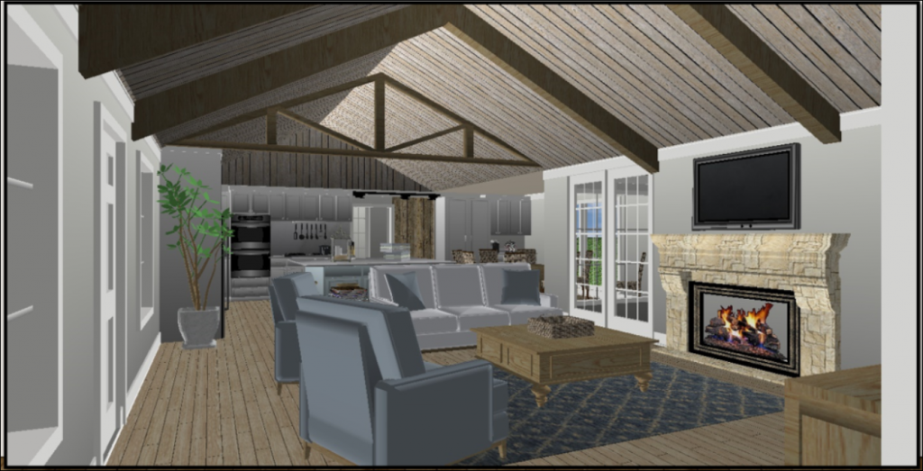
These first few renderings depict the more modern, open concept option. You’ll notice how open the kitchen is to the family room here. I’ve removed the wall between the two rooms completely so that the space is large and accommodating for their large family.
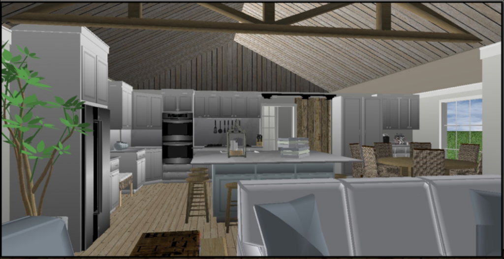
I showed them several perspectives so they could see the space from all angles.
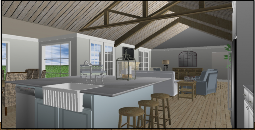
Here you see planks on the ceiling and one large island with the farmhouse sink.
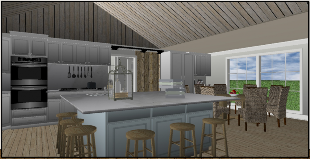
Notice the double oven placement, the single barn door, the double door pull out pantry to the right of the door and a coffee bar to the right of the pantry.
The island here is large enough to accommodate nine bar stools.
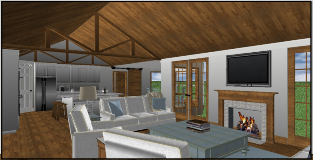
This option is still open concept, but a little more modern with the rich wood color and wood casings around the doors and windows. Notice the ceiling planks have changed color here, too. The fireplace is more streamlined.
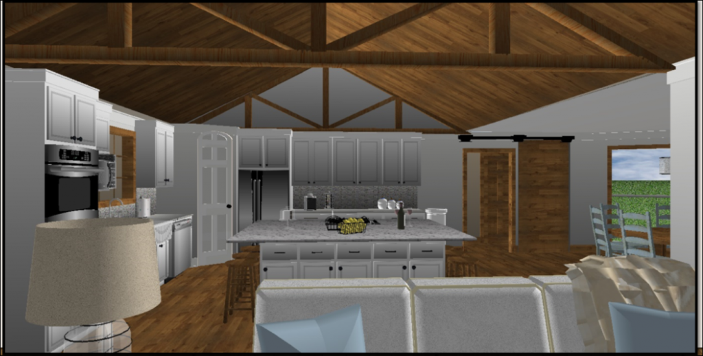
Here you see the double oven is now to the left as you enter the kitchen and the refrigerator is where the double ovens were. There is a corner pantry here beside the refrigerator instead of just cabinets.
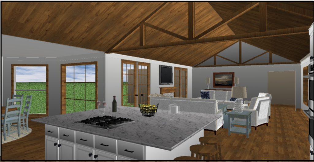
I’ve added a trusses at both ends of the space as well as the center. The cooktop is now in the island.
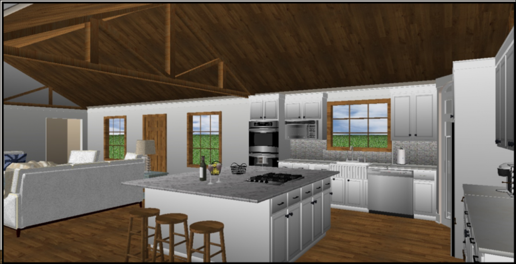
The farmhouse sink is now under the window.
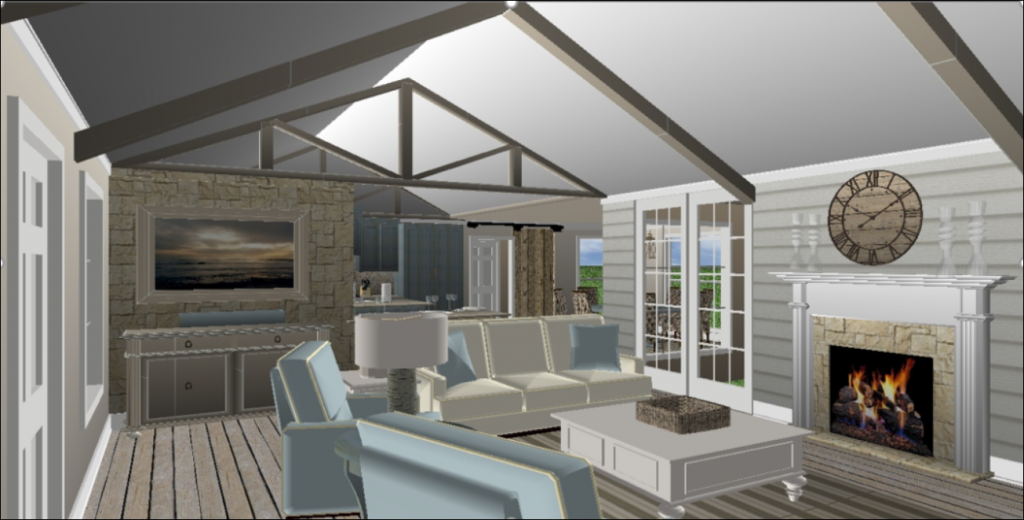
In this version you’ll notice there is a wall offering a little separation between the two spaces which is something he thought he might want. He wasn’t sure if he’d like a true open concept. An architect drew this floor plan up so I used it as my template for this design with a few modifications.
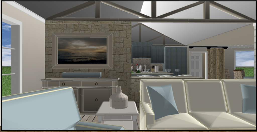
You’ll notice there is stone on the wall and on the peninsula island that stretches to the right of it lending it a Hill Country flare.
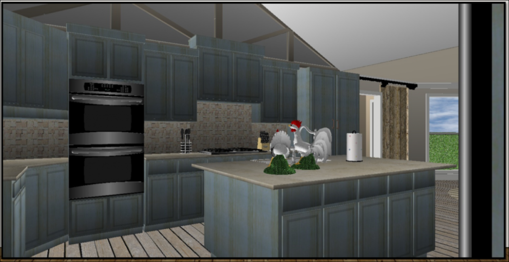
I gave them distressed blue cabinetry which has a “Farmhouse” feel.
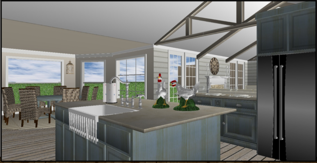
The sink is back in the island, the fridge is by the peninsula and if you look into the family room you can see shiplap on the walls.
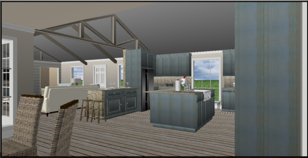
A different perspective here so you can see how it transitions from the kitchen to the family room. In this option I’ve left the window the way it currently is in their home now with the cabinetry split to either side of it in case they didn’t want to replace the window.
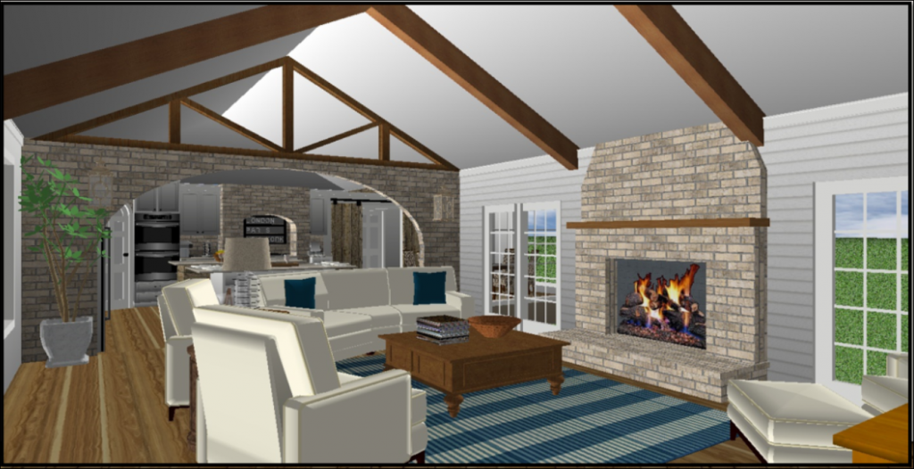
This option is the more “Traditional Farmhouse Look”. I’ve used a lot of brick here with a brick arched entrance into the kitchen, brick fireplace to the ceiling and kept the shiplap on the walls.
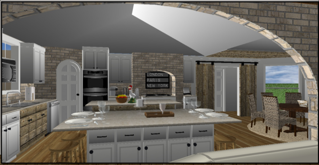
A closer view of the kitchen. In this plan I’ve given them two islands: A workspace and a serving island. Both with plenty of storage.
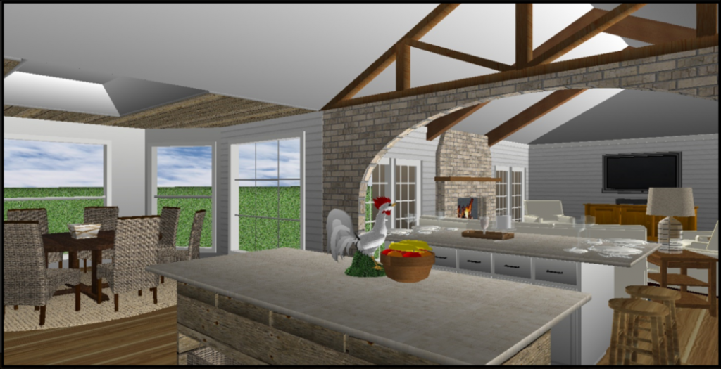
The work island is done in reclaimed wood (as is the sink cabinet over by the window – not shown in this view).
It’s a little hard to see, but the ceiling in the nook area has been raised with planks applied. The TV is placed on the far wall in the family room for easier viewing from the kitchen.
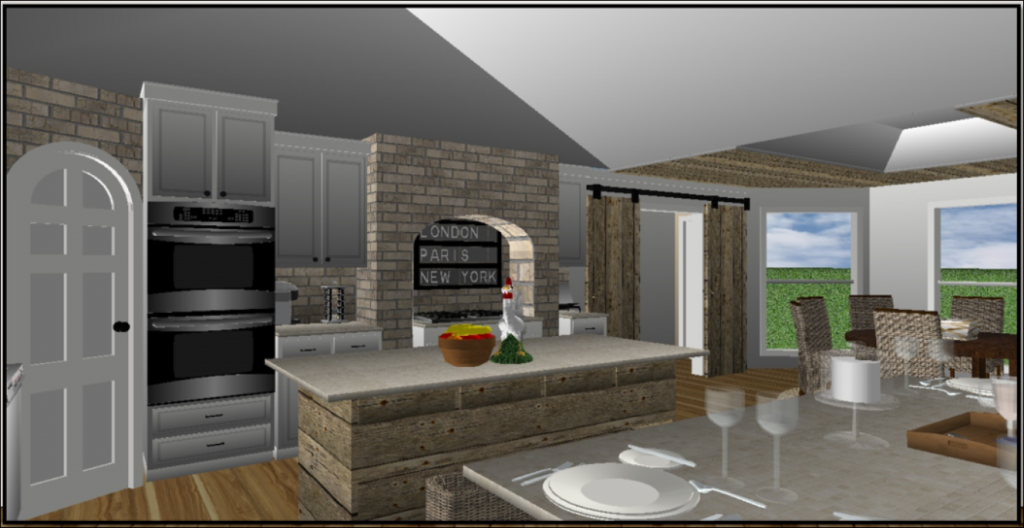
I’ve added a brick arch over the cooktop and double barn doors.
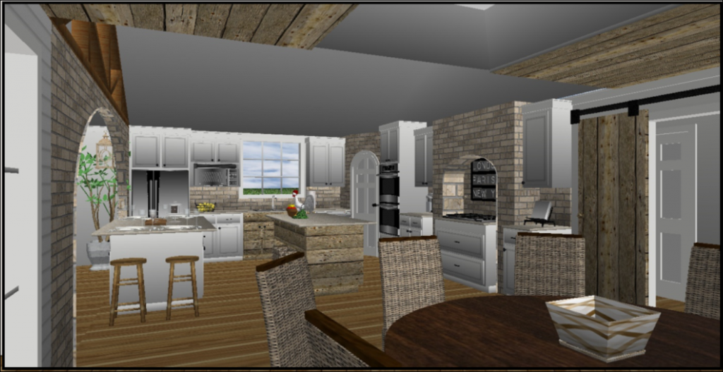
This gives you a view from the nook. Here you can see the cabinet under the sink is in the same reclaimed wood as the island.
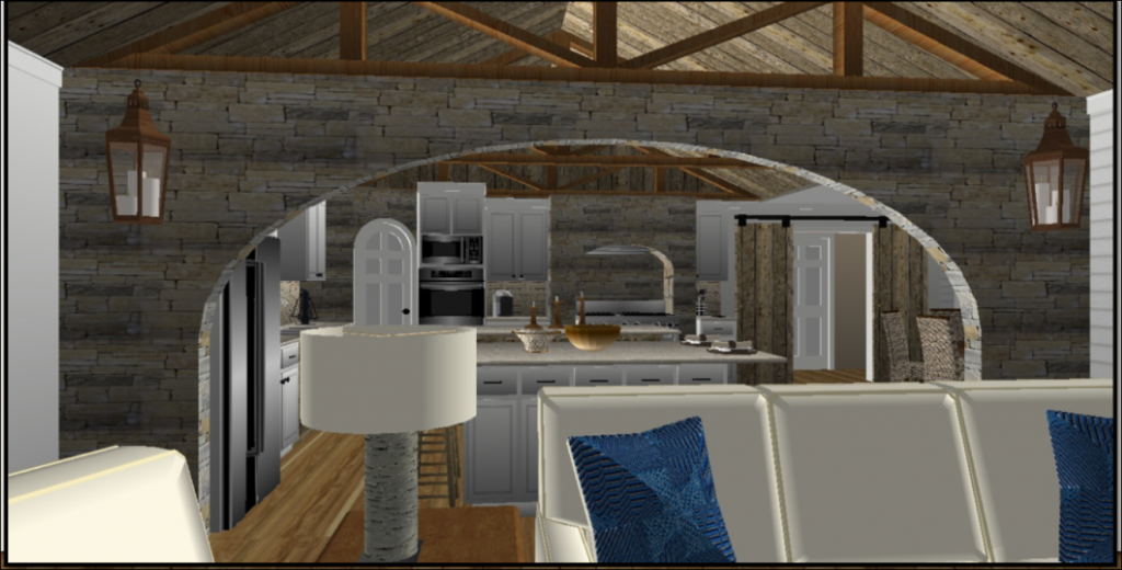
In this final option I’ve kept the basic layout the same as the previous one – just changing from brick to stone. The stone still has a “farmhouse” feel, but really brings in the “Hill Country” vibe.
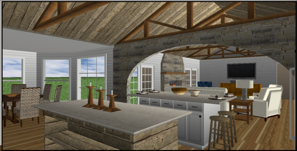
The fireplace is now stone and I’ve added several more trusses.
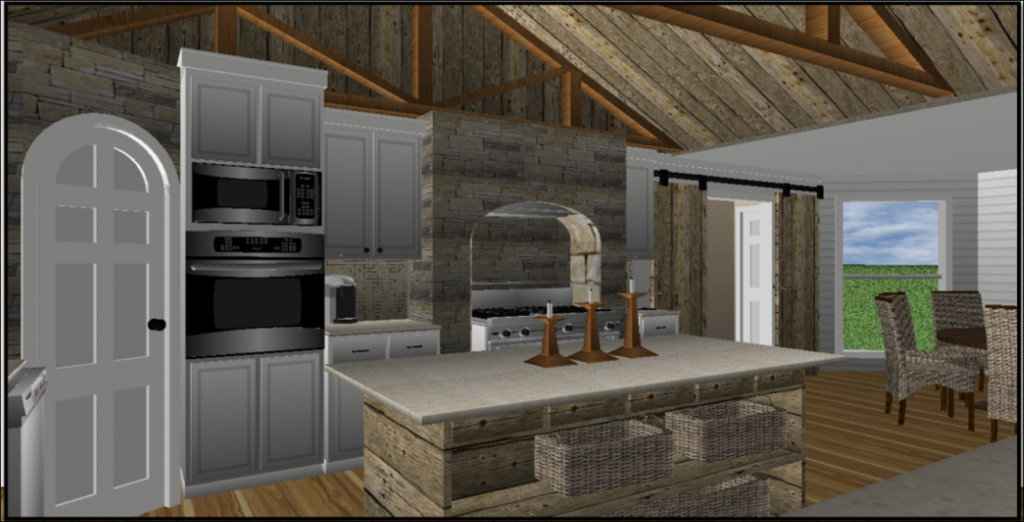
The cooktop has been replaced with a range here and the double ovens have been replaced with an oven and a microwave. Notice I put shelves on the island so that baskets can be used for storing fruits, potatoes, onions, etc.
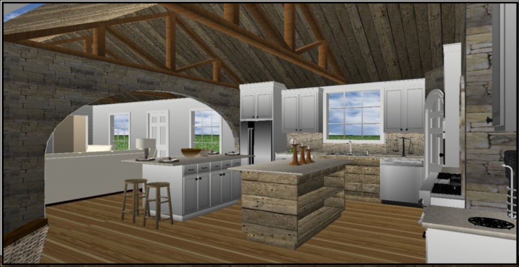
Another view from the nook area so you can see how it transitions into the family room.
***********************
Each plan clearly has its own personality and character. It’s just a matter of personal preference as to which style and which space plan is best.
These clients have made their decision and are actually combining aspects from several different plans (which is what tends to happen). Most people tend to like a little bit from each of the designs so we just combine their preferences and create the final plan customized to suit the client.
We are still finalizing materials to present to the contractor for the final bid.
But, we are all looking forward to getting started!
I’ll keep you posted on the progress!