I shared on my last post what we were doing with the “nuts and bolts” in the model home I’m working on with a partner of mine. Today I’m going to share the “fluffy stuff” – all the soft fabrics and furnishings that will bring the personality to the home. Considering our design theme that we coined “Hill Country Hip” we wanted to find fabrics that sort of brought in the natural colors of nature with some fun, hip prints.
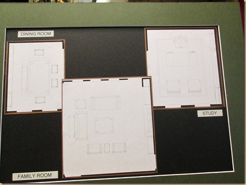
After we drew up the floor plans for each space…
(These are the plans for dining room, family room and study.)
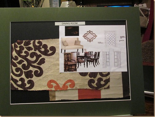
We selected our fabrics and furnishings to fit our “Hill Country Hip” theme and compliment the hard surfaces we selected. Like this large “hip” damask and wide stripe in terracotta, beige, bold brown and cream we chose for the dining room. We selected a cool bench seat to go with the dining table to throw in a fun flare. Notice the floor pattern in the top right corner and the drapery style on the lower right.
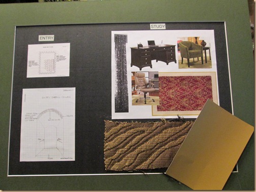
We chose a hip zebra pattern for the office. This fabric has a bit of a chic vibe to it in this rich texture and sophisticated color way. We’ll bring in color with a vibrant rug. The paint swatch you see will be our ceiling. (On the left is a picture of the barrel ceiling and the floor pattern in the entrance/hallway. We’ll do a slate herringbone pattern on the floor and a linear glass tile mosaic on the ceiling.)
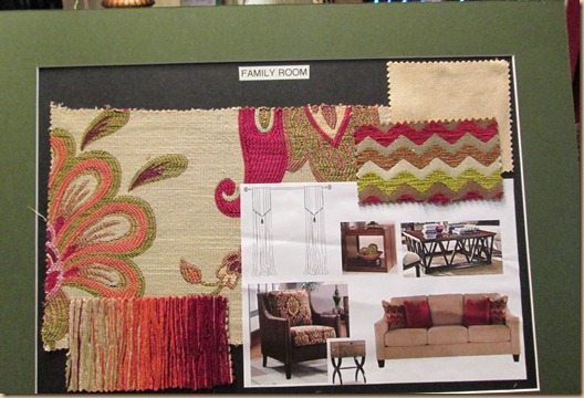
In the family room we’ve taken our color scheme and put a fun twist on it by going a bit brighter with them. But, we’re still using our beiges, terracotta’s, wine reds, greens, and brown tones. Every room is anchored with a more neutral palette and our patterns will be primarily the accent fabrics. (Little Note: Using different fabric patterns that compliment each other in a space helps bring interest and personality to a space. When selecting fabrics don’t be afraid to mix it up!)
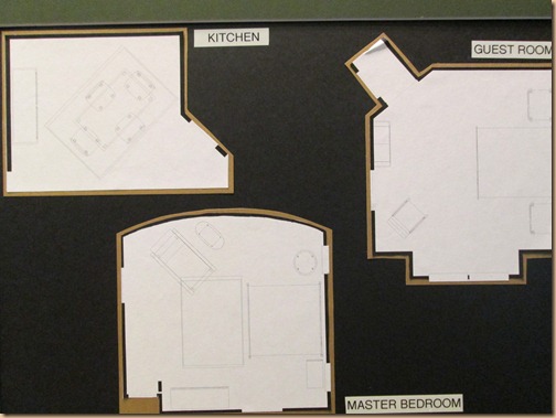
The space plan for the kitchen, master and the guest room.
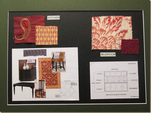
Carrying the same color palette to the kitchen with an emphasis on the red and gold tones we wanted a rich compliment to the soft terracotta we chose for the walls. We chose to add a cabinet in the mud room for storage. The fabric to the right will be the seat cushion.
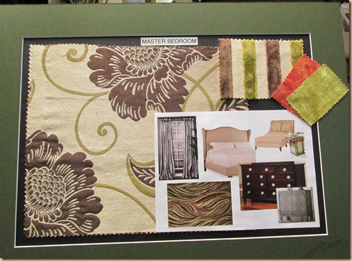
In the master we are emphasizing the browns, greens and creams in our accent fabrics, but we are going to take the terracotta to an all out orange for a little design “punch”!
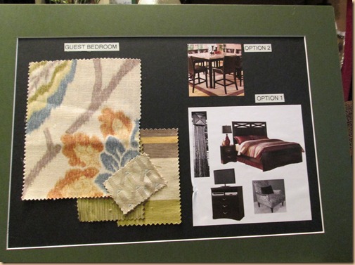
We provided an optional look for the guest room – one that could be decorated as a guest room or one that could be used as a functioning sales/conference room. They selected the conference room. Here you’ll notice we stuck with our overall colors, but pulled in some blue as well.
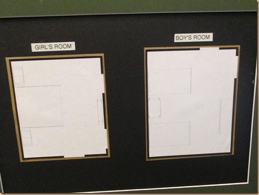
Hard to see, but these are the space plans for the boy’s room and girl’s room
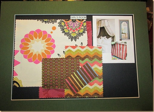
Again, we took our color palette and created a brighter twist to them for the girl’s room. Love these colors…..bright, happy, fun and “hip”. Notice all the patterns we are combining here.
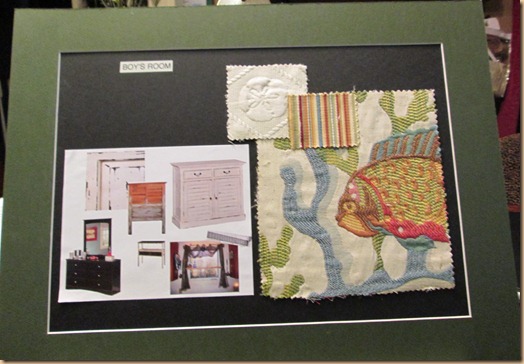
For the boys room we brought in the soft blue again to accompany the overall color palette, but the builder decided they wanted to design the space for an “older boy” rather than a young boy. So we will keep the color scheme the same, but find some more “grown up” looking fabric.
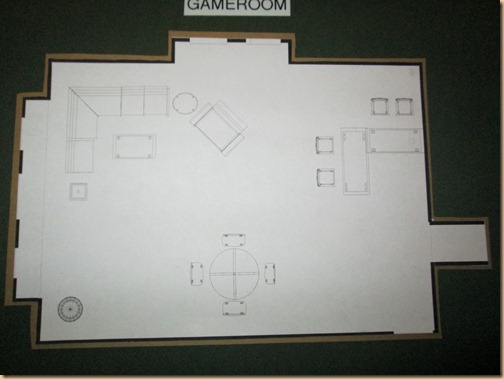
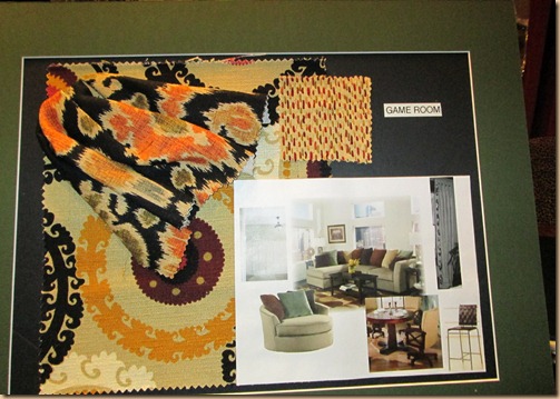
And, lastly our space plan for the game room…..
Here you see we continued the overall color scheme, but this time paired it with this rich pop of black.
So there you have it. Lots more work to be done.
I’ll keep you posted!
Happy Decorating!!
