One of my go-to vendors here in Dallas for countertops called Allied Stone has a pleasant, friendly, beautiful showroom filled with amazing countertop options (which I’ll be blogging about soon), but they also have a great kitchen vignette chock full of some great design details that I wanted to share with you today.
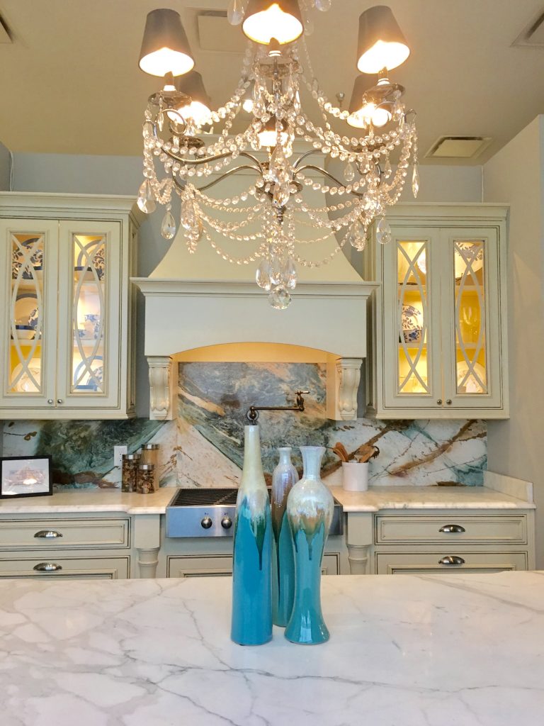
Let’s take a look at some of these details that make this such a spectacular display. First of all how ’bout that grand backsplash? If that doesn’t make a statement I don’t know what will. With everything else in the kitchen a creamy white this elaborate pattern strikes a chord. The turquoise and the copper color running through it really make a statement without being “too much”. It lends the perfect amount of pop and color and yet the kitchen maintains a classic, timeless quality.
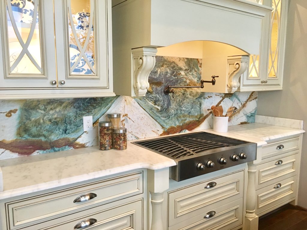
Notice the corbels by the vent-a-hood, the legs on each side of the cooktop and the back lit glass doors with their interesting curved design. These details, although subtle, contribute an enormous amount of “punch” to the overall look of this space and add a specific touch of glam.
All of these details make a huge difference.
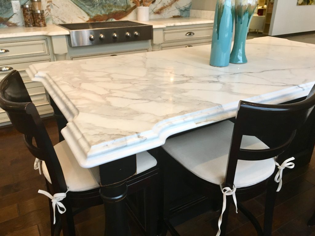
There’s a couple of things to notice about this island – namely the shape of these corners and the waterfall edge. These are details that can really contribute to your space and give it a more individual or unique look over the standard square edge. And, the black paint color works very well with the cream countertops, but sets it apart as a piece with its own personality.
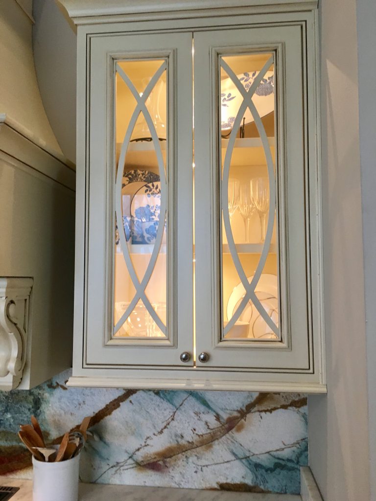
This close up view gives you a better perspective of how wonderful these glass doors look and the amazing color and pattern in this backsplash.
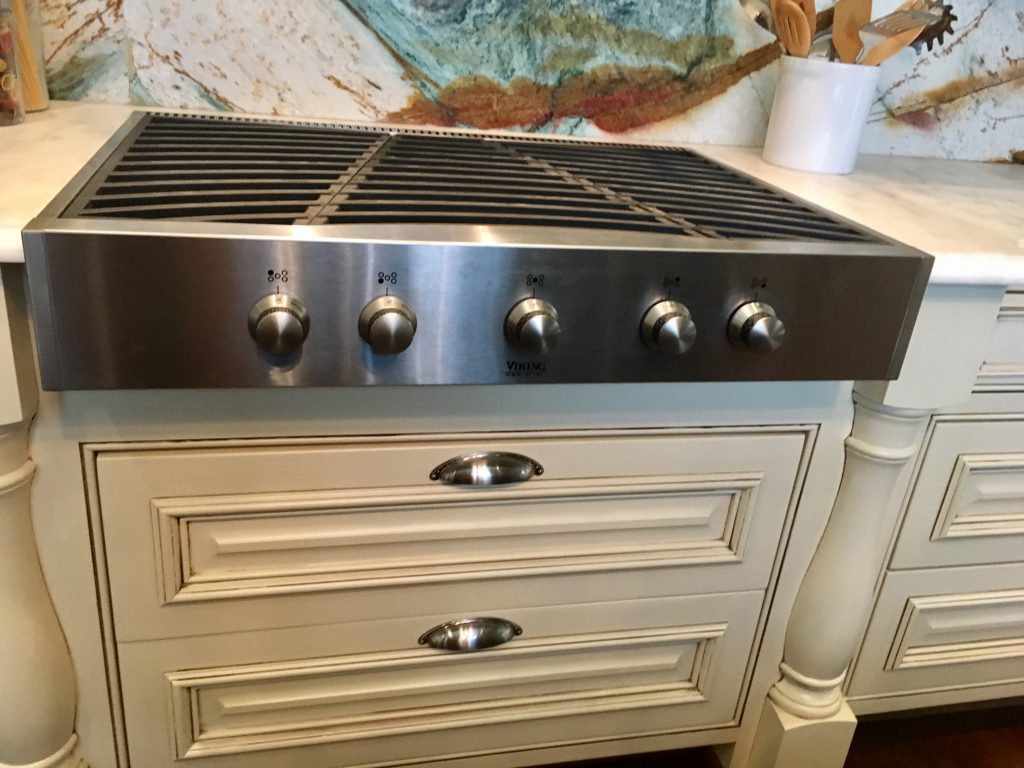
These wide drawers under this Viking cooktop provide ample storage….
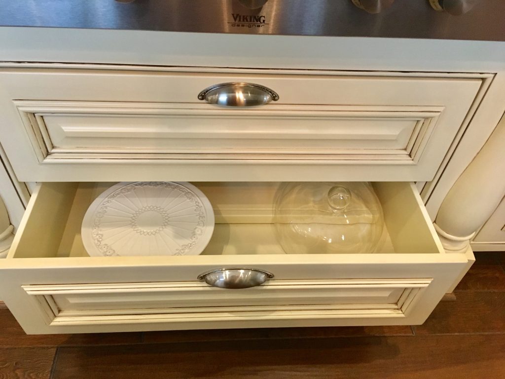
As you see here.
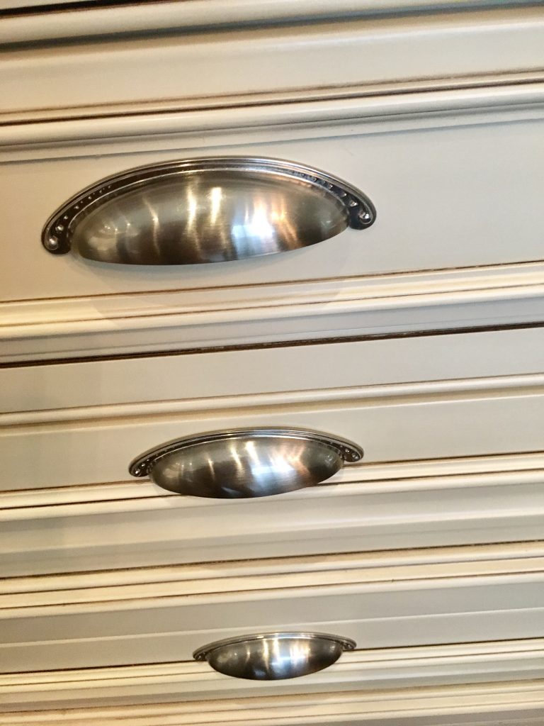
These brushed nickel cuff drawer pulls are a nice compliment to the cream cabinets.
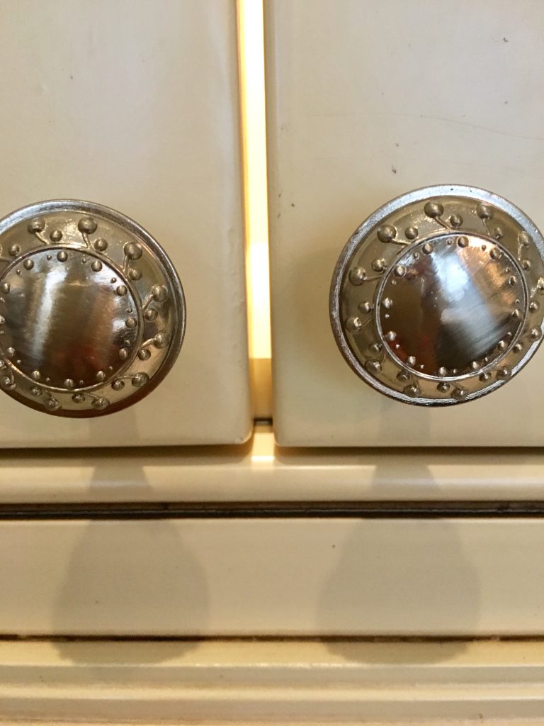
And they work well with these round drawer pulls.
Mixing and matching the pulls and handles is one of those design details that adds a bit of interest to the cabinets.
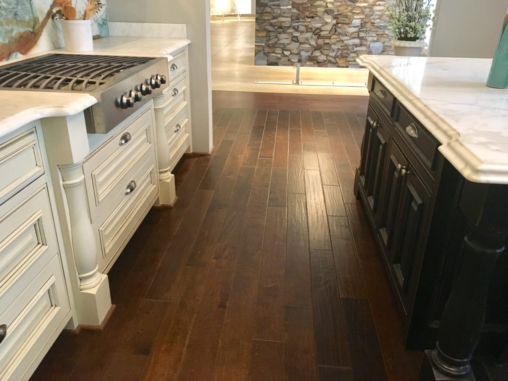
Notice the cream cabinets with the black island and the stained wood floor. All these colors work great together. No need to be matchy-matchy and no reason not to combine colors and textures.
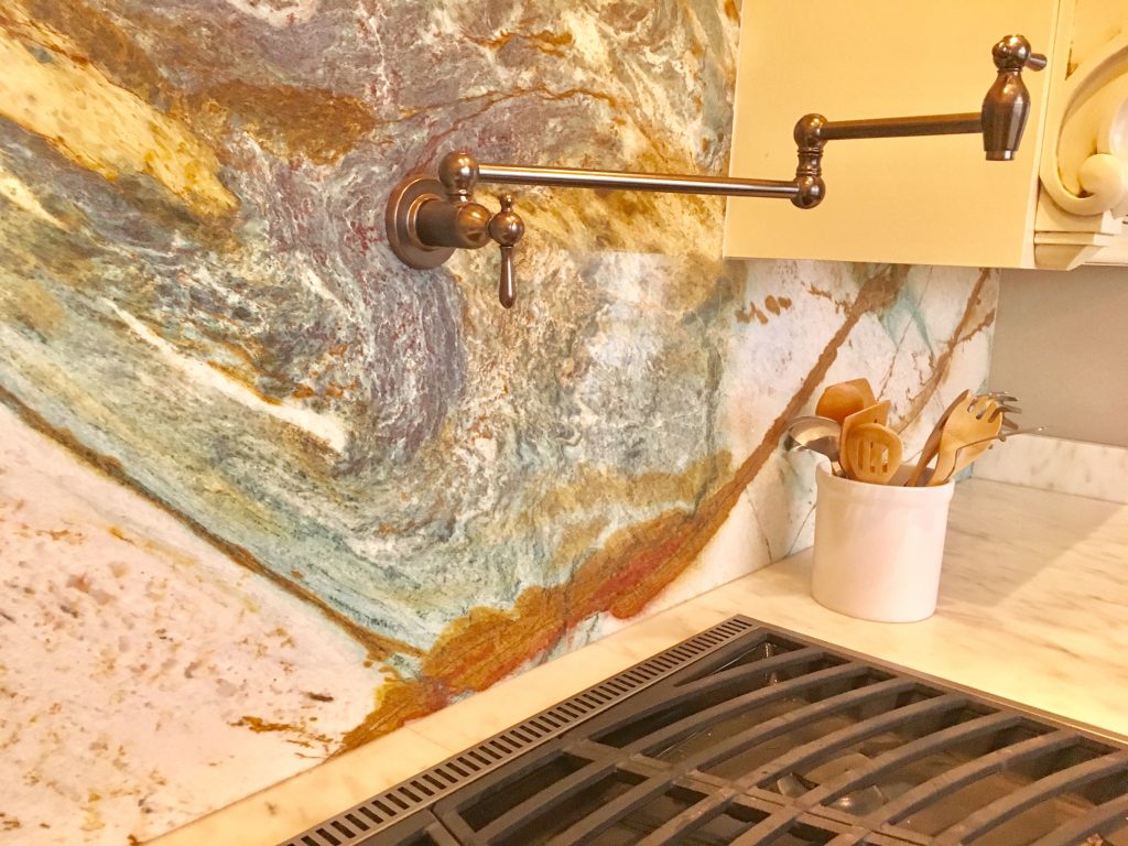
This little detail is one of function and style. In case you’ve not seen this before it’s a pot filler which enables you to fill the pots with water with more ease – rather than dragging them back and forth from the sink. And, this style adds to the character of the space and lends more interest to the overall design.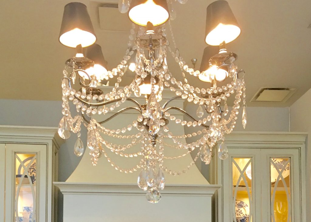
And, last but not least, this stunning chandelier adds so much pizzazz to this space. Why not put something like this in the kitchen? If you like a bit of a formal look, if you are a shabby chic peep or if you just happen to love the sparkle and glitz of a little bling – adding a glamorous chandelier is just the thing you need to make a deliberate statement.
I hope this spectacular vignette appeals to you as much as it does me and gives you some fun ideas for your own home.
Happy Decorating!