When Jared contacted me to help with design of his new insurance building I was happy to take on the challenge. We were under a bit of a time crunch so space planning, decisions and selections had to be made fairly quickly. Aside from being one of the nicest clients I’ve ever had the pleasure of working with Jared has great vision and is quite the “DIY” guy. He can knock out walls, put up walls, faux finish, tile floors and much, much more. Not that he did that with this project, but with his DIY talents he had a bit of a “designer’s” perspective on what my vision was and could easily integrate my idea’s with his own specific needs. Jared, his talented wife, Cindy, and I all worked together tirelessly, yet easily, and were all extremely pleased with the end result. Here is the transition from the original shell to the sensational end result.
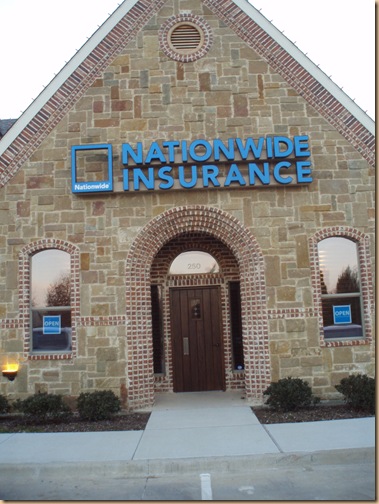
This exterior was already complete when I started this job.
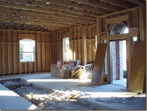
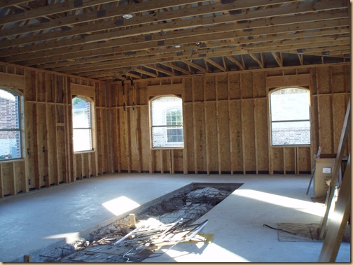
But, inside this was the original “shell” when I started the project.
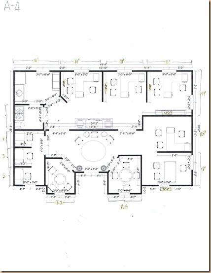
After taking the measurements and pictures and discussing with Jared what his needs were for employees, clients, etc. I drew up several optional space plans like this one.
We tweaked and moderated the space plans to accommodate all of Jared’s needs, selected all the materials, then began the construction phase.
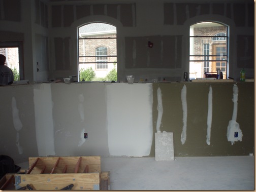
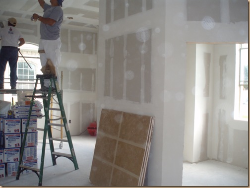
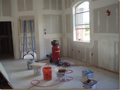
The walls went up to form the offices.
The bathroom and kitchen were framed out.
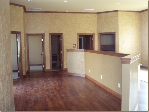
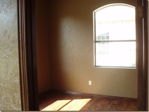
After much patience the faux finish and trim were completed.
Separate offices were ready to go.
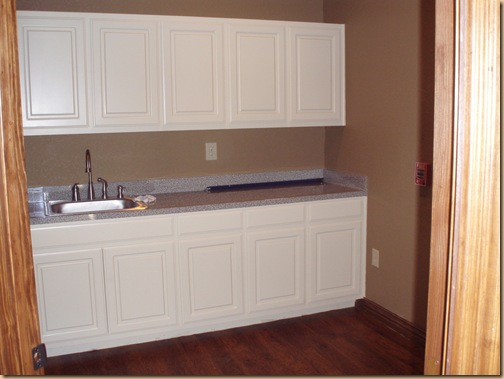
The kitchen cabinets were installed.
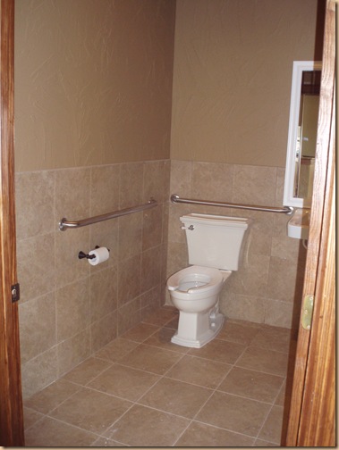
The bathroom tile and fixtures were in and it was ready to be decorated.
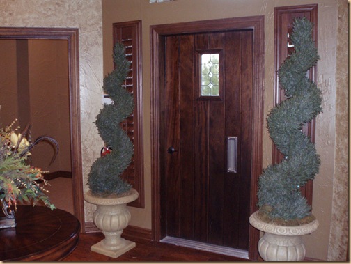
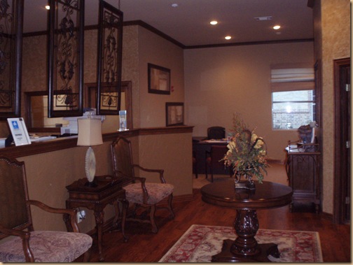
At last we were finished and they were ready to welcome clients to their beautiful new reception area.
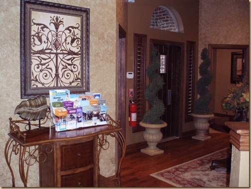
Large iron wall hangings separate the entrance from the work station and add an interesting, charming twist to the commercial space.
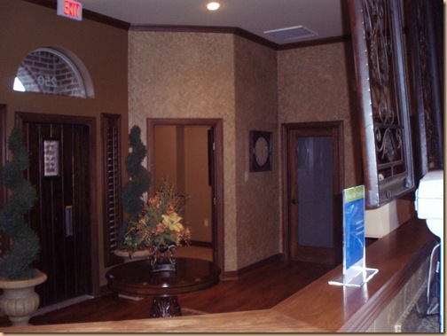
Another view. Notice the glass door to the right? Jared put the film on it himself.
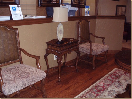
These stylish chairs welcome customers while they wait.
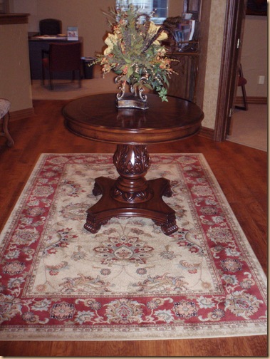
With the bargain we got on this rectangular rug we opted for this shape instead of the original circular rug we planned for. But, it looks great.
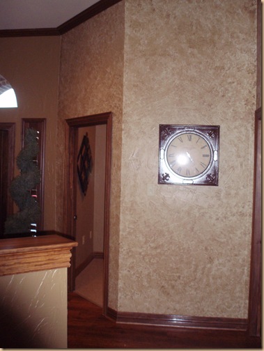
The faux finish actually turned out a bit more “mottled” than anticipated, but it ended up looking really nice when all was said and done.
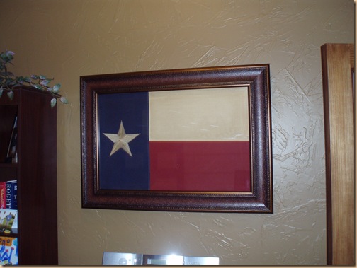
The one piece Jared really wanted for his personal office was the Texas flag. I was so happy to find this flag and have it custom framed for his own office space.
I found this cool console to display his work paraphernalia on. It’s actually a wine console, but it makes for a fun, interesting piece for this space. The artwork above is actually a print of an iron piece complimenting the iron dividers.
This particular commercial job was a fun challenge given the time crunch we were working within, and as I said working with Jared and his wife, Cindy, was an absolute pleasure. (By the way if you’re in the Flower Mound/Lewisville, Texas area and need insurance – he’s your man: Contact Jared Rosckes with Nationwide Insurance .) A man of extreme honesty and integrity I can assure you that you will truly enjoy working with him. Check him out!
And if you pay him a visit be sure to let me know what you think of his office!!
