I thought since I’ve never done a blog about my office that I’d go ahead and do it now that I’ve been here four years…..about to go into my fifth year!
(I’m not sure why I’ve never blogged about it before actually.)
I rent office space from Remax Realtors – in the back of their building.
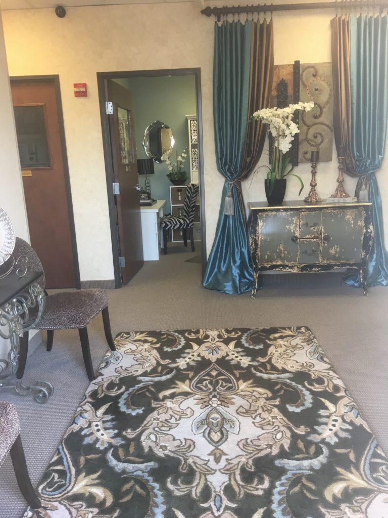
The office you see here where the door is open is mine and the one directly to the left of it is my friend and fellow designer Kristy Mastrandonas. We each have our own offices and businesses, but we share a resource room. This is our entrance/lobby, separate from the front of the building, that we decorated for our own personal use. The drapes are a combination of ready-made silk drapes (the bronze color), and custom made silk drapes (the blue) in some leftover fabric Kristy had. This cool chest I purchased from a vendor at the World Trade Center (who’s no longer there) and the artwork is from a wonderful local to the trade vendor called La Montage. She always has a multitude of amazing pieces at her showroom from talented local artists and we were happy to display one of her pieces here. The floral on the chest is from HomeGoods and the candlesticks are just some old ones I had that I painted to go with our décor. This fun rug is from one of our favorite vendors, Surya Rugs. We loved the modern take on a traditional rug. Fits our style and colors perfectly.
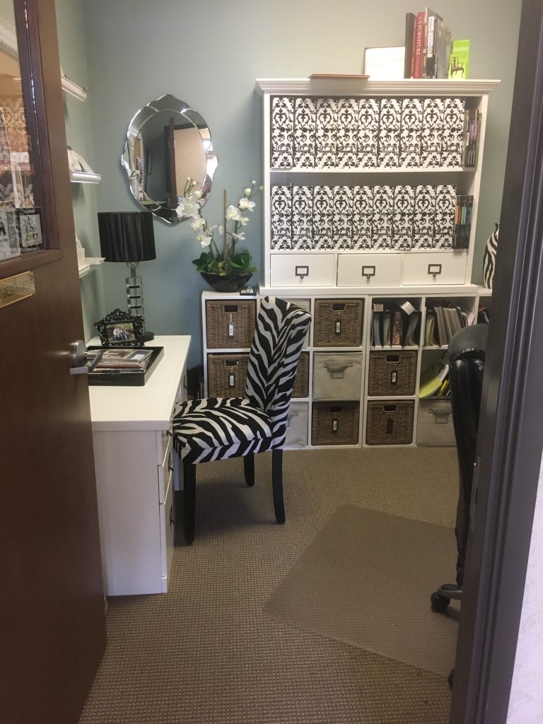
This is my personal office. We did both our offices in an almost identical style/layout. Kristy had plenty of this white furniture from her home office that she purchased from Ballard Designs so she was able to split it between both of our offices. What you don’t see showing is to the right I have a large corner desk and shelves that I purchased at IKEA.
We painted our walls Sherwin Williams Quietude. It was between that color and Sherwin Williams color Meditative. If you notice a theme between those two names well we did, too, (hahaha) and wondered if it was our psyche’s telling us we needed to go for a calm, soothing color. I’m sure of it actually! The Quietude is perfect, because it is exactly that: Calm, soothing, subtle. The accents are black and white to give it some pop and interest. The zebra chair is from Pier 1 and the black and white magazine storage boxes on the shelves are from Office Max.
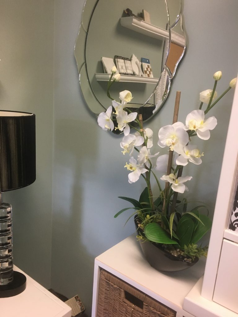
The orchid is from HomeGoods and sorry…..but, I can’t remember where the mirror is from. I think I got it from Hobby Lobby, but I can’t say for sure.
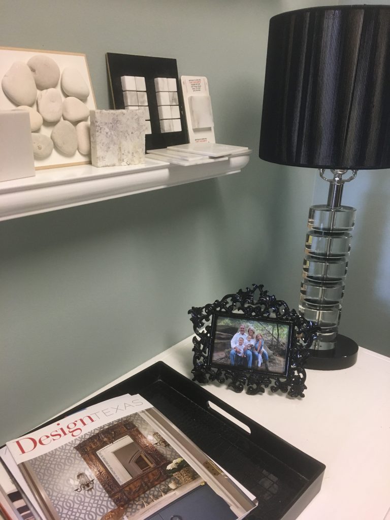
That’s my hubby and I with our grandmunchkins. I actually did a blog post on a Staycation with my family when we got these family pictures. You can check it out here if you want. That’s what it’s all about, right?
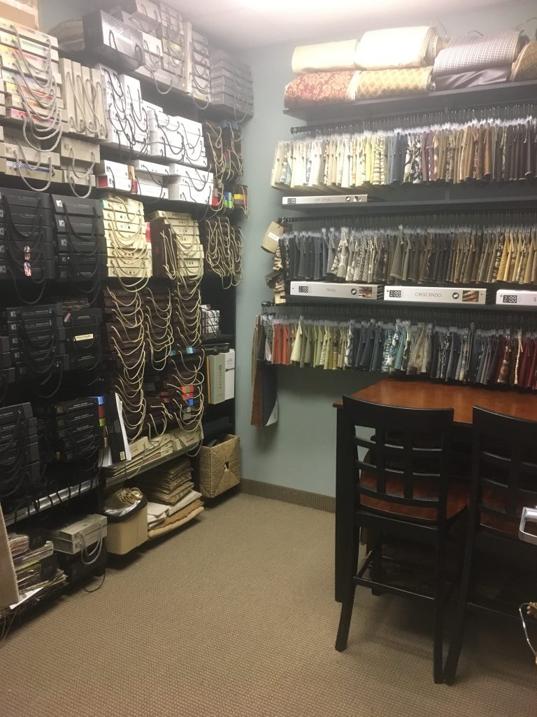
Like I mentioned before, Kristy and I share our resource room which is where we have all of our drapery fabrics, upholstery fabrics and resource material. These shelves came from my own home office (purchased from IKEA) and the table and chairs I purchased at what used to be called Gardenridge which is now called At Home.
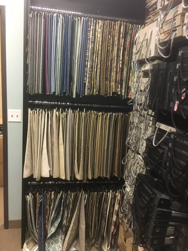
This particular rack we had to have custom made to fit the space.
It’s a small resource room, filled to the brim, but it works for us.
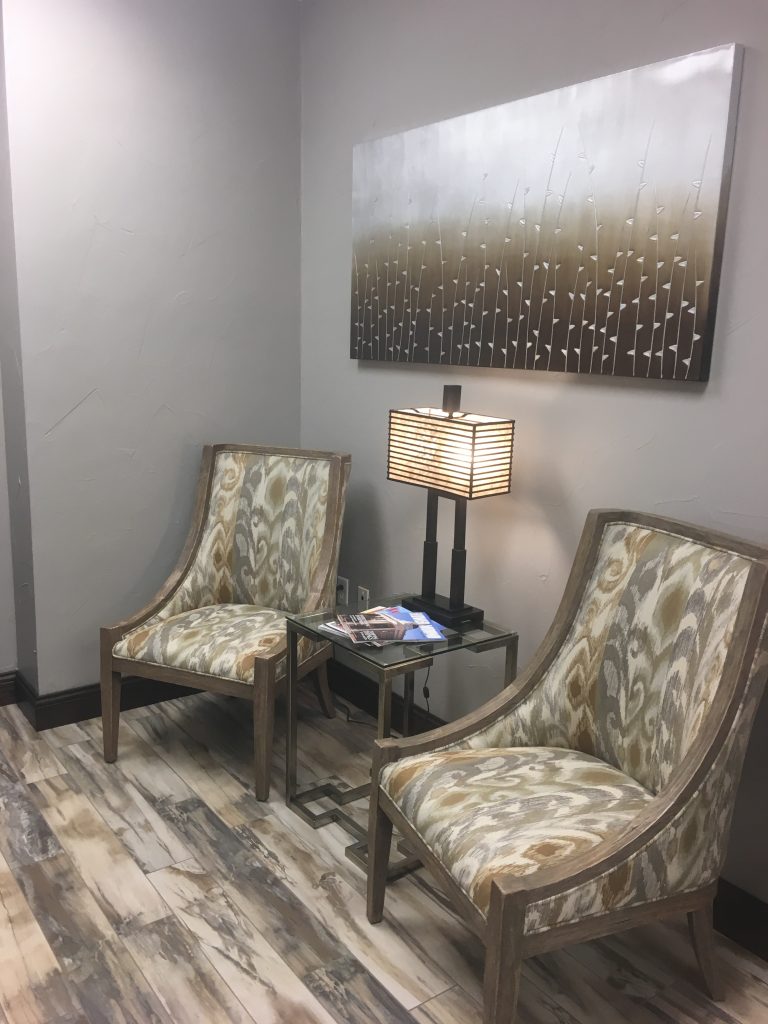
This is the front reception office that we share with Remax Realtors. I redesigned this space last summer with Kristy as my sounding board and helper. It’s a more transitional space than our own personal area which is what they wanted. It was a fun project because they were open to some fun details like this great distressed wood look tile floor from Emser. The furniture, lighting and artwork is from one of our favorite, go-to vendors called Uttermost.
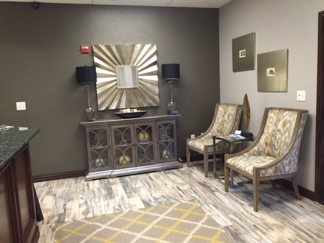
This is just another view of the reception area – again with furnishings, artwork, rug and lighting from Uttermost. That back wall is painted a beautiful dark gray called Sherwin Williams Porpoise. It’s a great backdrop for this gorgeous chest and mirror and makes a nice contrast to the other walls which are painted Sherwin Williams Pussy Willow. These two colors work beautifully together. And they look great with the floor.
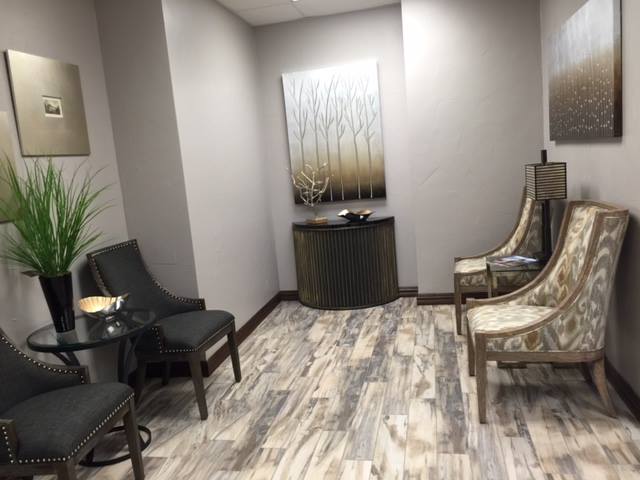
Again…another view. Transitional, streamlined, “clean”.
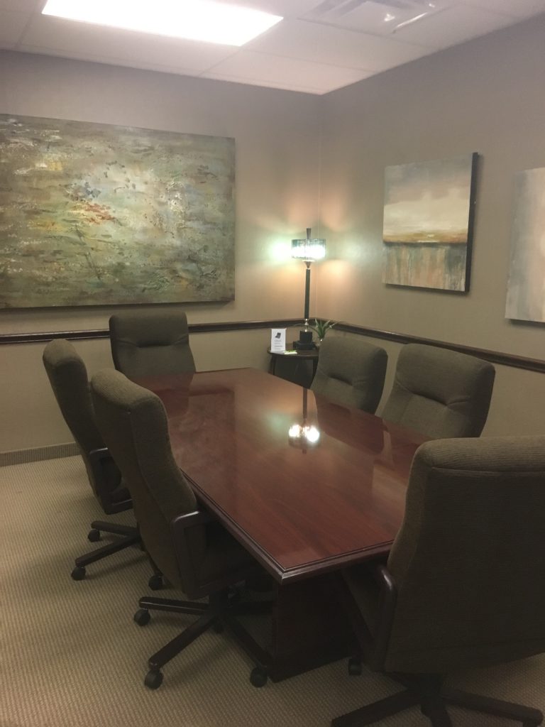
This is the conference room we share with Remax. This conference table and chairs were already there – I just added the lighting in the corner and the artwork. The large piece of art is from Uttermost, the smaller pieces are from At Home. (FYI: Pairing less expensive retail pieces with more expensive artwork almost always gives the less expensive pieces more substance and oomph!)
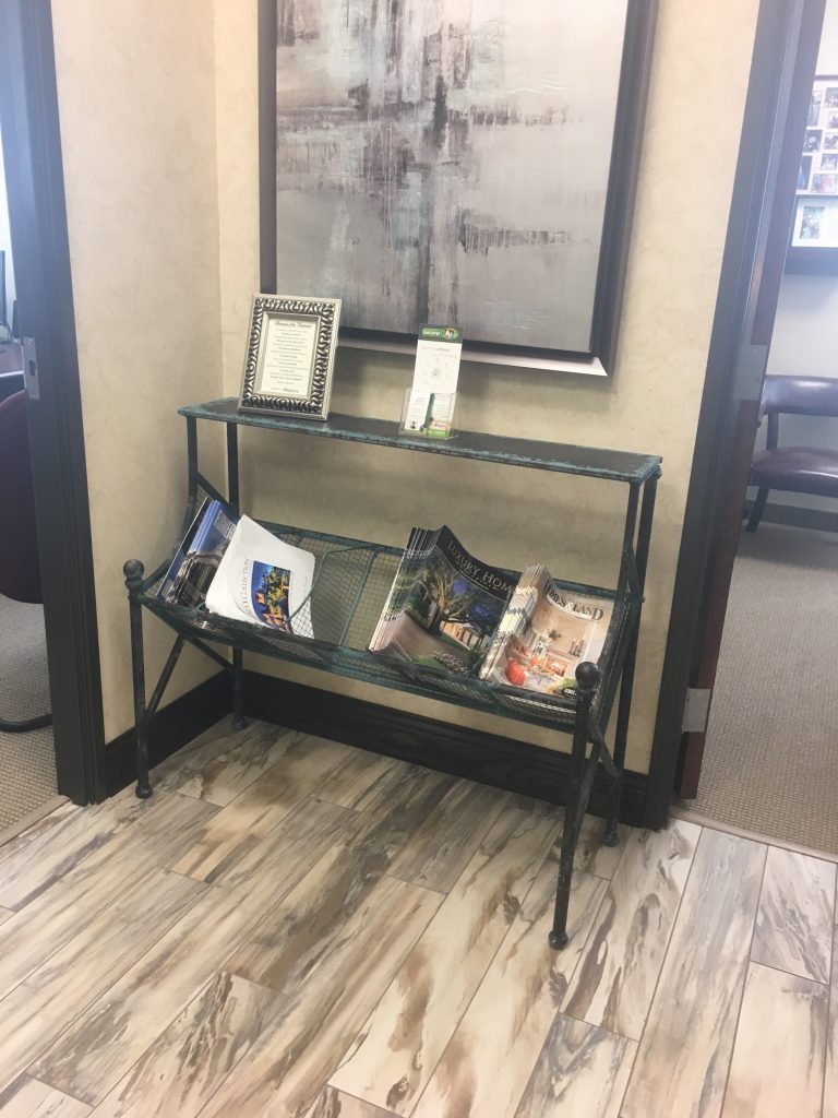
This magazine rack is from Uttermost, the artwork is from At Home.
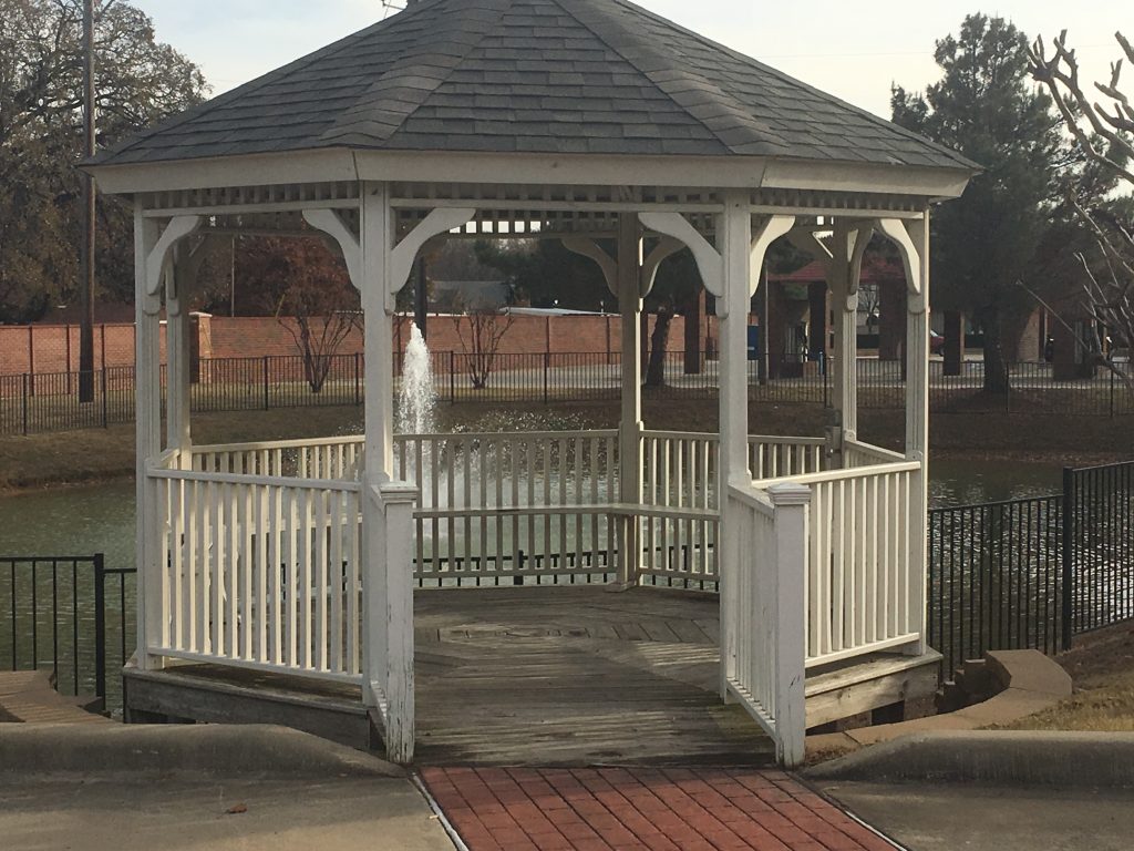
When we need a break and some fresh air we have this gazebo and this wonderful view…
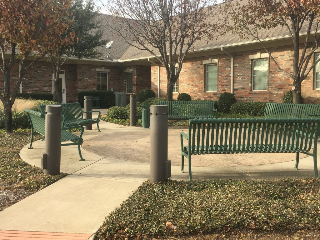
Or this little outdoor sitting area. Both very handy when the stress level is heightened and a connection to nature’s calming affect is needed! I’m sure you can relate!
It’s a great place to be – five minutes from my home and fifteen minutes from Kristy’s.
Can’t believe we are going into our fifth year here. Crazy how time flies!