So the fifty million dollar question when you’re ready to re-do your bathroom is, “But, what do I want to do?” or, “How do I design my bathroom?”. And, the second question is something like, “How much is this going to cost me?”
And, many times the tendency is to procrastinate and let the whole process drag out because you just can’t figure out what to do – therefore you do nothing. Am I right?
Because fortunately (and in some ways….unfortunately) there are a multitude of options for any given space and it’s not always easy to know what the heck you should do or what you want to do.
An example of the many different faces and personalities the same exact space can take on is seen in the renderings below. These are some renderings I did for a client a while back so they could visually see some of the options for their master bathroom.
Same bathroom, different space plan, materials, paint, etc.
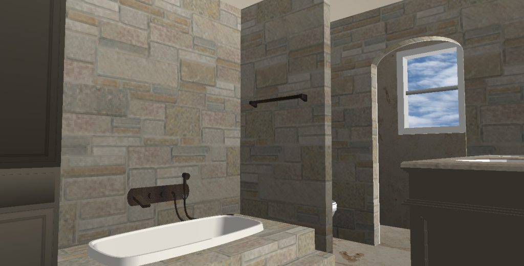
Did they want to completely gut and rearrange? Add this cool stone to make it really interesting and full of character? Warm up the cabinets with a darker paint, do the undermount sinks and tub in a biscuit color?
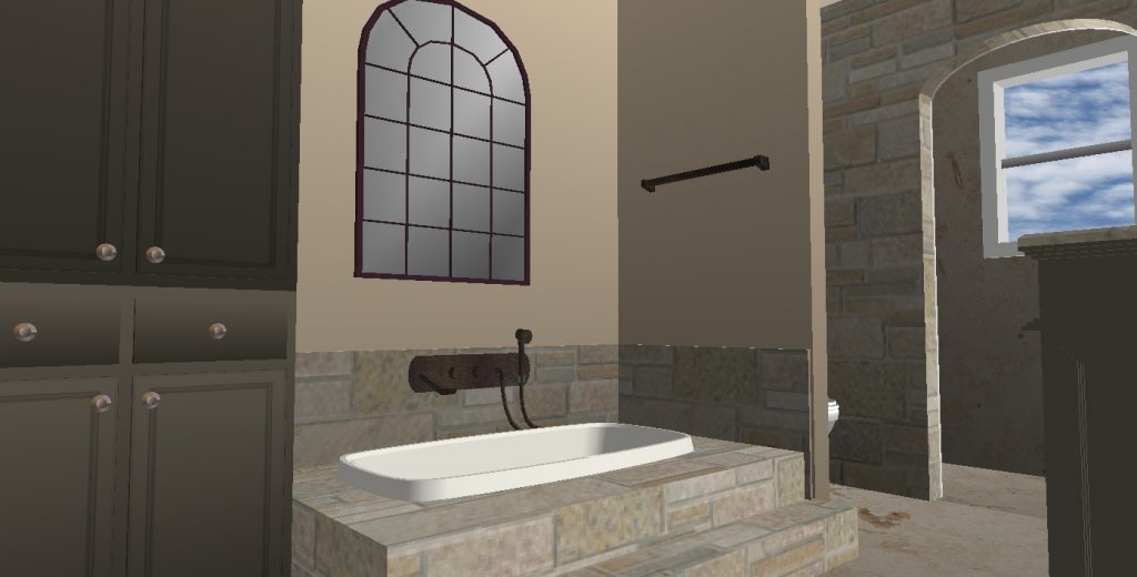
Or maybe do some stone, but not quite as much for a little softer look?
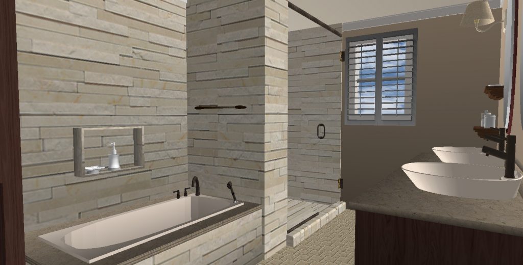
Maybe leave the basic layout from the original bathroom design instead of rearranging everything and just add a different type of stacked stone? Paint the walls beige and install vessel sinks?
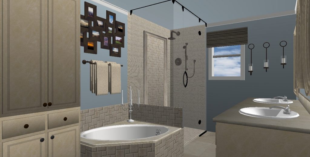
Perhaps no heavy stone at all, just some interesting tumbled marble around the tub and shower, a frameless shower enclosure, blue walls, beige cabinets a white tub and white drop in sinks?
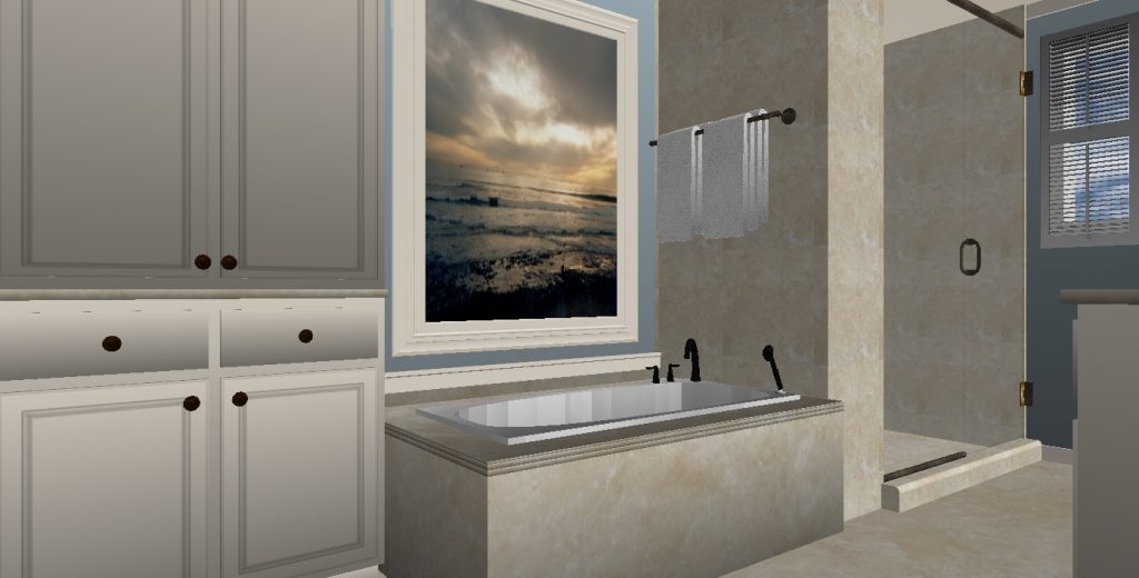
Possibly a marble slab for the tub deck and surround, cream cabinetry?
See what I mean…..so many things to think through. And of course your budget will dictate much of this. As well as other factors such as: How long are you going to live in this house? Are you just getting it ready to put on the market? What is the overall value of the home?
Here’s another example of various options for a bathroom that I did for another client. (You may have seen these on a previous post.)
You can see how the entire personality of the bathroom changes depending on the materials and colors selected. Again…..same space, very different end result.
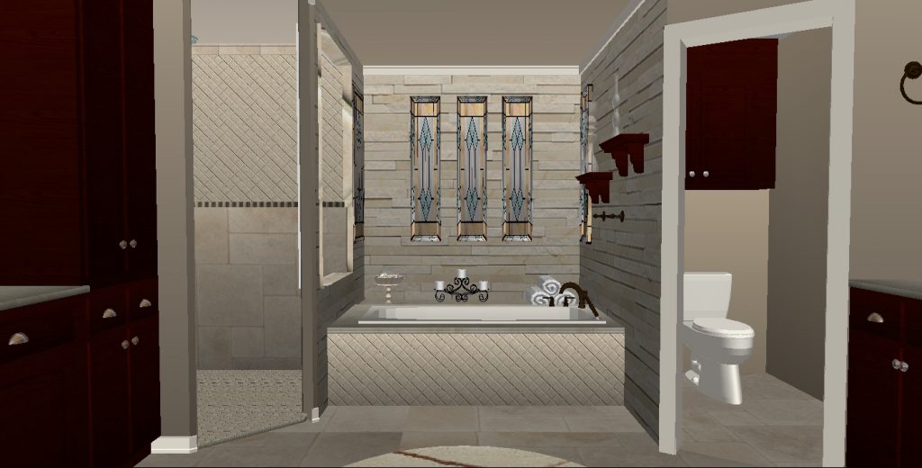
Again…..stone and neutrals? Keep their stain glass windows?
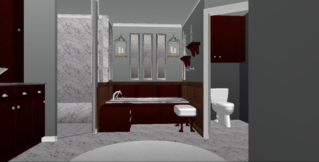
Marble and grays? Wood paneling around the bathtub niche? Update the windows?
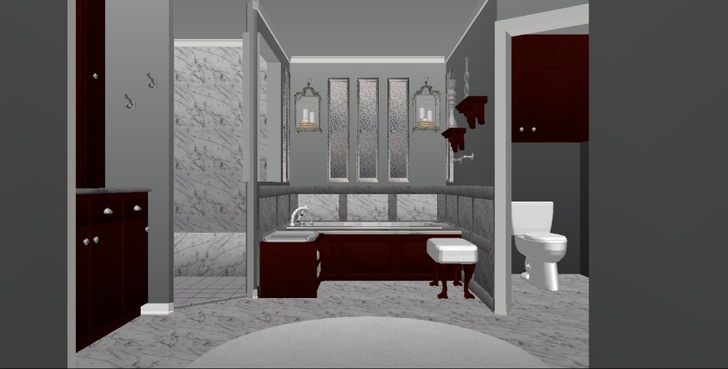
Marble around the bathtub niche?
Thus the question……How to design my bathroom?????
If it’s a major re-do the smart thing is to hire a local professional interior designer who knows what they’re doing to help you out. They know the products, they know how to space plan and they usually have connections to competent contractors you can trust to work with you and do a good job. And many can provide drawings like this for a better visual into the particular space in the optional materials you are interested in.
If you’re lucky enough to have a nice size budget – good for you! – just be sure you are selecting materials that really go together well, compliment one another, are appropriate for the bathroom and have the end result you are after. (Again this is where a professional designer is worth their weight in gold)
But, sometimes you don’t feel your budget will allow for that or maybe you just like the process of design and want to try and do it yourself. If that’s the case there are a few steps to follow.
The first thing you should do is figure out what type of budget you are comfortable with. Because if you only have $10,000 to remodel that’s going to determine what you are able to do verses if you have $75,000. I know – obvious, right? But, you’d be surprised at how that little issue rears its ugly head. People really do think they can get the finest champagne for a simple beer budget. And when it comes to bathroom remodels it just doesn’t work that way. (No matter what you see on HGTV) The problem is people almost always, always, always gravitate to the more expensive looking tile or countertop material. Why?….well, because the more expensive the material the more it tends to have that additional visual interest to it, that “cooler” vibe and that wow factor we are all looking for than some of the more standard materials. Then they are either crushingly disappointed that they have to settle for less or they’re faced with busting the budget they were originally comfortable with to get what they really want. So think the budget through and determine what you can realistically afford. Then be careful to stay with product and prices that are within your financial comfort zone.
There are plenty of standard materials that are wonderful and many ways to incorporate touches of more expensive accent tiles or décor to create more of a “wow look” without breaking the bank. Just be realistic about what works for you, do your homework and be sure you are satisfied with the selections before you pull the trigger.
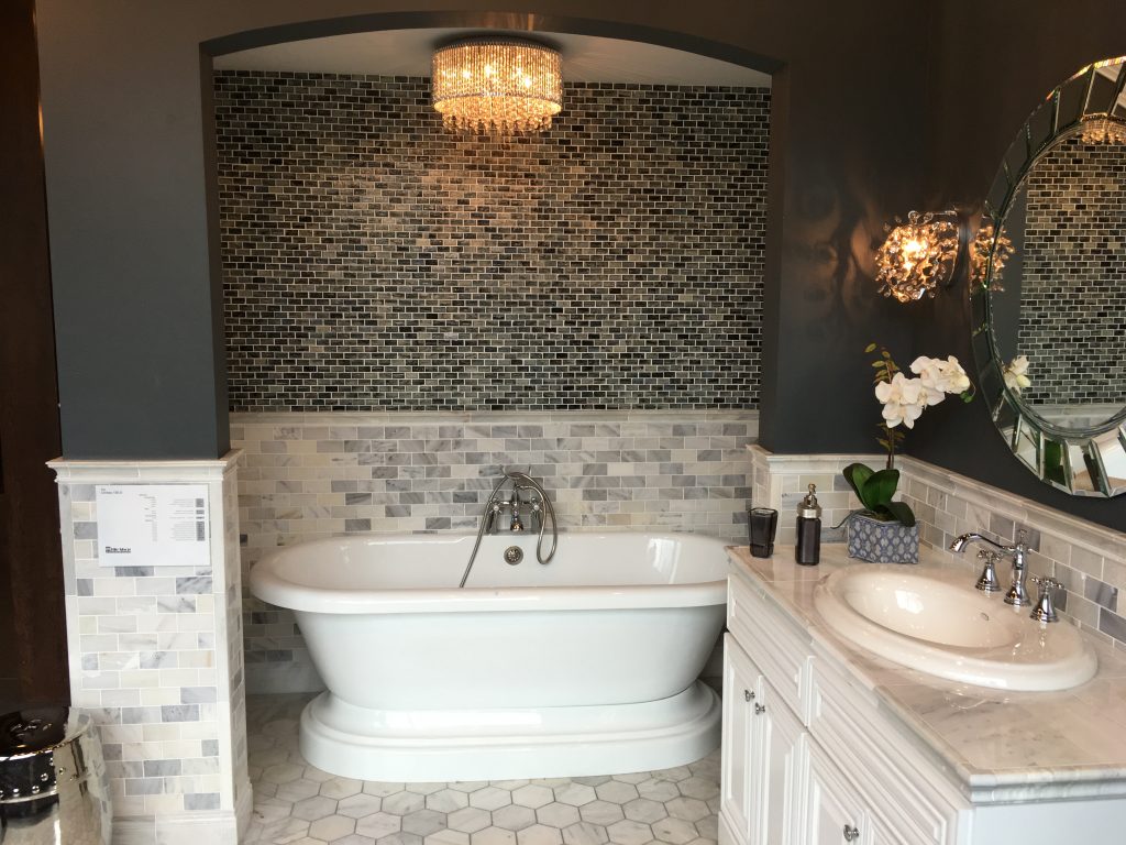
The second thing you should do is go to your local tile or granite shops and peruse their showrooms to see their vignettes. For those who really need that visual edge for confirmation this is a huge bonus. If you’re in a small town that may not be as easy for those in a larger city. But, of course with the internet now it’s so easy now to access just about anything you want on Houzz, Pinterest, blogs (like mine!), etc. And, those are great, but seeing it in person helps all the more.
All of the pictures of these vignettes you see today are from a great source called The Tile Shop. This showroom is here in Dallas, but they are a rapidly growing company and expanding all over the country. If you’re lucky enough to have one of their showrooms near you it would be worth your while to go take a look at their vignettes. They not only sell to contractors and designers they also sell retail which is helpful to the DIY-ers who want more choice than Home Depot or Lowes might have to offer.
Be careful to take in all the details you see here. For one – look at that dark paint. Most people would shy away from the thought of that, because they would instantly say it’s too dark in such a small space. But as you can clearly see – it’s not. If anything it lends a certain elegance and warmth you wouldn’t get otherwise. Notice how the dark walls and the dark tile behind the bathtub play off all that white and gray. Stunning. And notice all the different sizes and shapes they’ve combined here? A wonderful vignette to show you all the fun you can have IF it’s in your budget. If not, you take elements of what you see here and incorporate it in a way that gives a little wow without breaking the budget. And, how about the beautiful lighting? Add pizzazz with your light fixtures like this gorgeous crystal fixture, but be careful with lighting over your bathtub. Even though it’s a glamorous look and we all love it – there are factors to consider and NEC (National Electric Code) guidelines that dictates a number of particular rules to follow when installing over a tub. So be careful to pay attention to that. Electricity and water are not good companions. Neither is a busted bulb that can potentially fall into the tub and shatter.
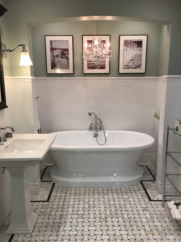
The third thing to do is keep an actual notebook filled with tear sheets of looks you like or just keep an online notebook on a personal file, Pinterest or Houzz. Start collecting pictures of what appeals to you.
. In this particular vignette you see a beautiful chandelier over the tub (don’t forget to be careful with this and check city code), soft green walls and lots of black and white. I don’t think it’s a secret to anyone that white and gray, white and black or just plain white is all the rage now. It’s clean, serene, classic. No wonder its all the rage. Remember – the wall color choice will be a large factor in the overall feel of the space when it’s complete. So give that some serious thought and sample the colors first before slapping it up on the entire bathroom.
Again take in all the details here: Simple subway tiles taken about 2/3 up on the wall. They’ve finished it off with a nice trim edge. In contrast to its simplicity they’ve done the floor in this interesting pattern. But, notice the border? For added impact they’ve created a border with a thin black linear tile and inside that is the marble cut to fit.
The three simple pieces of artwork over the tub is all this vignette needs. 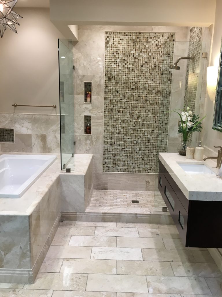
In this vignette notice instead of doing like the first picture you saw and covering the entire wall with the accent tile, they’ve done what’s called a picture frame accent. You’ll notice that the mosaic has a thin, raised trim piece around it. This finishes off the look like a picture frame would and defines the area. It’s called a pencil liner trim mold. Again they’ve combined a multitude of sizes and shapes which makes it more interesting. Also, look at the bottom of the tub and the entrance into the shower surround. Those are beautiful extra trim details you can do to enhance the overall look if it’s in your budget to do so. If not, that is something that could easily be eliminated and still look very nice. Additional elements in this vignette like the floating cabinet, contemporary light fixture, cream countertop with the thick straight edge and the simple pretty flower arrangement all contribute to this overall look.
If your budget is smaller than this use look alike porcelain instead of marble (they’ve got some great ones now), purchase a contemporary vanity at IKEA, Home Depot or Lowes, eliminate that snazzy base trim, create a much smaller picture frame design in the shower surround and eliminate the light fixture. There are ways to achieve some snazz without going broke. Be smart, think it through, adjust your design to fit your budget.
Fourth – be sure to collect samples of the materials you are interested in to take home and lay out in the bathroom so you can make sure everything is cohesive. Does the tile work with the granite? Does the granite and tile work with the cabinet and the wall? Are the fixtures in keeping with the overall style?
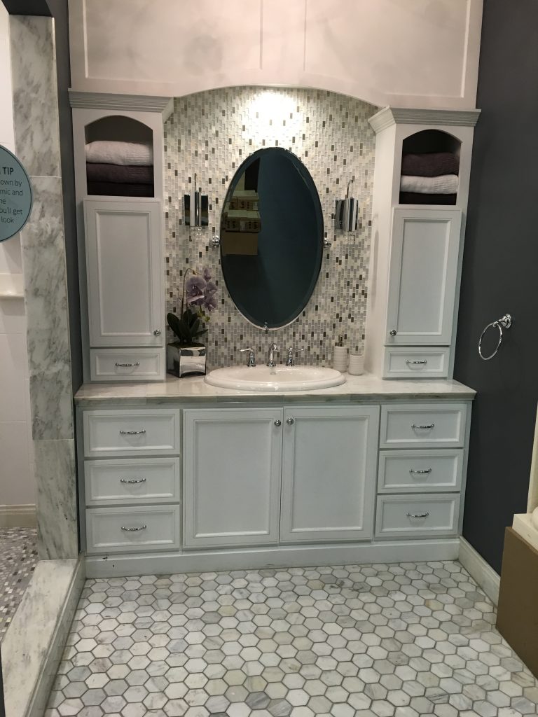
Think about some fun extras if you can afford it like putting tile on the wall behind the mirror if you have a little cabinet area like this. This particular tile is pretty pricey so it’s not for everyone. Again – notice that beautiful dark wall to contrast all the white? Wall color is important – it’ll help set the tone of the space. Do you need more cabinet storage, but you’re short on space? Consider adding countertop cabinets on each side of the sink like you see here.
Fifth – if you are going to gut the bathroom and rearrange things make sure the design is functional as well as visually pleasing. This should actually be something that’s been discussed and taken into consideration after deciding on the budget and as you’re looking at vignettes and pictures to get ideas. Make sure the design works and that the toilet’s not too close the shower door, the cabinet doors have plenty of space to swing open, the shower stall is the right size – not too big, but not too small, the shower plumbing is installed in the right place, etc. I had a neighbor once who’s contractor put the plumbing in a very small shower stall directly across from the door so that when he would try and turn it on it would spray him and shoot out the door. He’d have to reach in really fast, turn it on and then jump back and slam the door quickly while the water heated up! Not a functional design or a mistake you want to make!
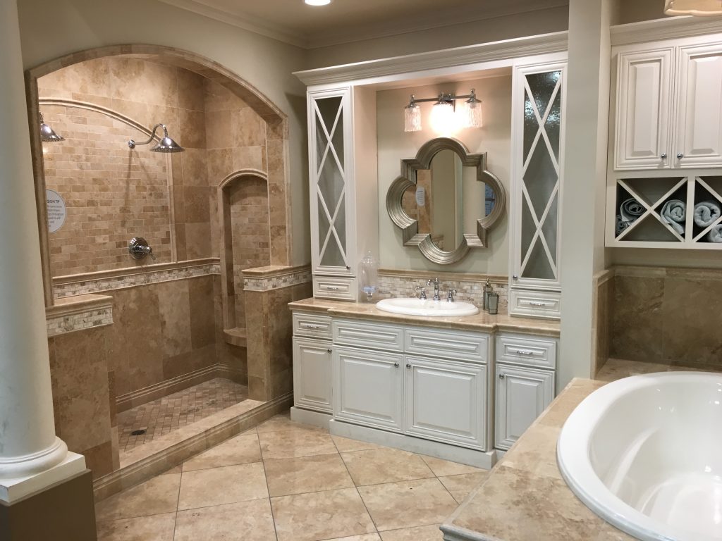
This is a much more traditional bathroom design. They’ve accentuated the shower with an arched entrance and mimicked that in the shower surround design. They’ve combined a number of different sizes and shapes and used a lighter accent for contrast both in the shower and behind the sink. Notice here they’ve done a simple backsplash height rather than the entire wall on the mirror wall. Again they’ve finished out the shower and tub (tub trim not shown in the picture) with a tile trim piece to match, The warm tones in the marble are a rich contrast to the light cream cabinets creating an atmosphere that’s very tasteful and classic.
You’ve seen how different a space can look depending on the materials and colors selected and you’ve seen several beautiful vignettes here with some really great ideas…..
So when planning your bathroom remodel and design plan remember to:
Set a budget you’re comfortable with
Seek out showrooms with vignettes or model homes in your area
Peruse sights like Houzz, Pinterest, etc.
Keep a notebook or online file with all your favorite looks
Get samples together and lay them out with the wall and cabinet paint/stain color to make sure it all flows cohesively
If you are gutting and rearranging make sure its a plan that is both functional and visually pleasant
Seek a contractor with a known reputable tract record
A key bit of advice is to remember it always seems to take longer than seems humanly possible to deal with before its complete. Remodeling can take some time especially if you or the contractor run into some unforeseen issues.
But, “this too shall pass” as they say and then suddenly its all over and you have yourself a beautiful new bathroom! So patience, patience my friend.
Take your time, do your research, stay within your budget, do it right and have fun!