Okay, so I know that once again I’ve been MIA from the blogosphere. And, once again I apologize profusely to those who follow me and are wondering what the heck is going on. Last fall, then the holidays, and then the beginning of this year have been beyond busy and I just haven’t had the time to devote to blogging the way I used to. As much as I love it, and as much as I want to – I just haven’t been able to carve the necessary minutes out of the 60 hour work weeks I’ve been putting in to devote to my blog.
But, upon my re-entry into the blogosphere in 2015 I thought I’d share a recent project I designed for two of the nicest clients I’ve ever worked with. Both beyond excited about getting their hands on their soon to be new home and re-vamping it to suit their active family and lifestyle.
An older home with small rooms and low ceilings they just needed some visual help in seeing their dreams come to fruition.
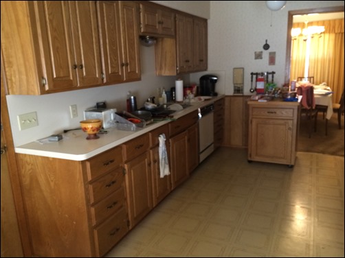
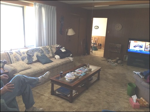
This is the original family room with the kitchen just on the other side of the wall.
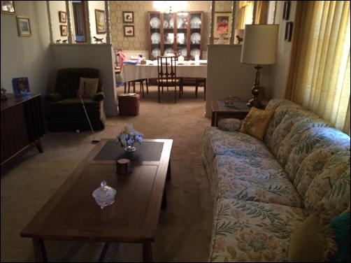
And, just on the other side of the other wall adjacent to the TV in the family room is the living room you see here with the dining room just beyond that. The dining room is, as expected, right beside the kitchen. You can see the home is in need of some serious updating, but visualizing the changes for most people is a bit of a challenge. And, my clients were no exception.
So in order to give them the best visual and see the potential in the space I wanted to lay out three different options for them to consider.
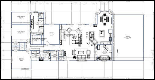
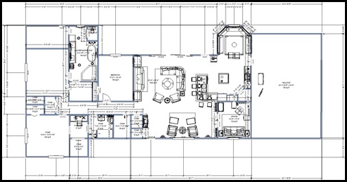
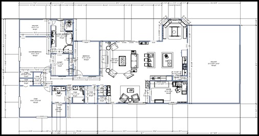
Each needed to start with a 2D floor plan so they could easily see the lay out. Here you see an angled peninsula in the kitchen and a particular lay out with the furniture.
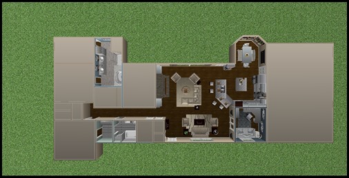
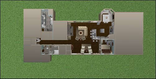
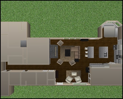
This aerial perspective shows the same floor plan in color which gives it a little depth. and makes the details a little easier to see.
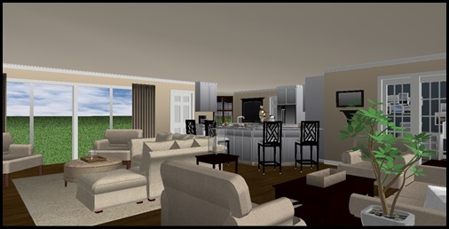
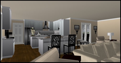
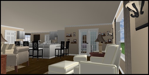
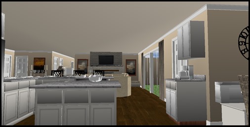
This 3D view helps give them an accurate visual of what the space would look like as they entered the house. The wall is gone from in between the kitchen and family room and also between the family room and living room to create a large open concept floor plan. The French door you see leads into the home office which is where the dining room once was.
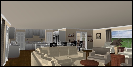
Here you see the view from the patio doors.
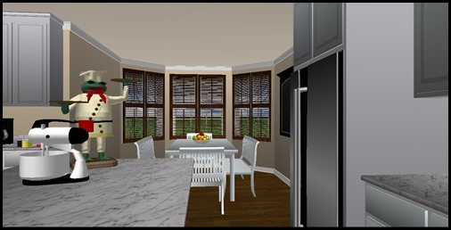
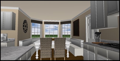
And, this perspective shows a freestanding table and chairs with wood blinds in the nook.
In this plan you’ll notice the peninsula, rather than angled, is squared off.
Here again is the color aerial view. You’ll notice some of the furniture has been altered to show some different configurations.
Another view from the entrance….
From the patio doors….
And, here you have a view from inside the kitchen to the fireplace wall.
In this lay out the nook houses a banquette with an oversized table that seats 8 to 10 people. And, here the windows are flanked with woven woods.
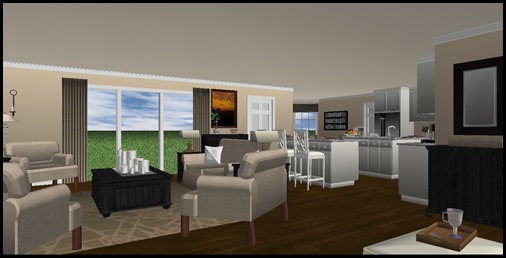
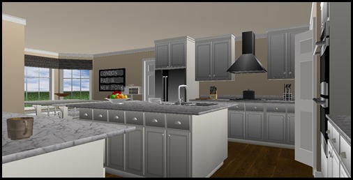
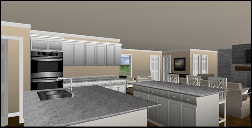
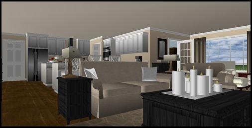
In the third and final layout you see two islands instead of a peninsula and yet another furniture configuration.
In this configuration I pushed the wall back to put more “real estate” in the kitchen rather than in the office – creating a large, very spacious kitchen.
The view from the entrance…
And, from the kitchen….
And, again from the patio doors.
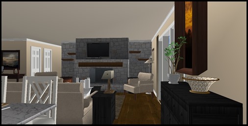
In this final perspective you see the fireplace wall with a different look than before. Here you see a stone wall with floating shelves.
Along with the 3D perspectives they were able to walk through the space on a virtual tour for an even better visual and real life “feel”. They laughed at the end of the presentation and said they felt like they were on Property Brothers. They got a kick out of the similarities. (I had never even seen the show until a couple of weeks prior to their presentation! – I think maybe I’m the only person alive that hadn’t!)
They’ve recently moved in and, with his experience in the building industry, are doing much of the work themselves with the help of a contractor friend.
Can’t wait to see the end result!
Happy Decorating!
