One thing that’s almost always tough for a client to do is visualize a space that the designer can see so clearly. The more visual aids at their fingertips the better in order to make informed and accurate decisions.
So whenever possible I like to give my clients that visual edge they need to really see the space finished out the way I see it. It makes it easier for everyone involved: The client, the designer, the contractor…..
Here are three of my current projects that I’m designing right now.
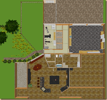
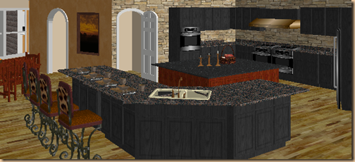
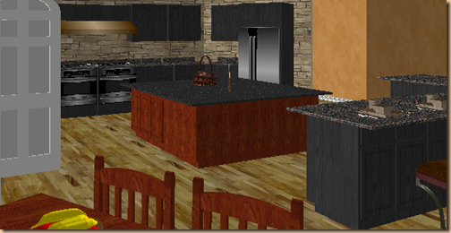
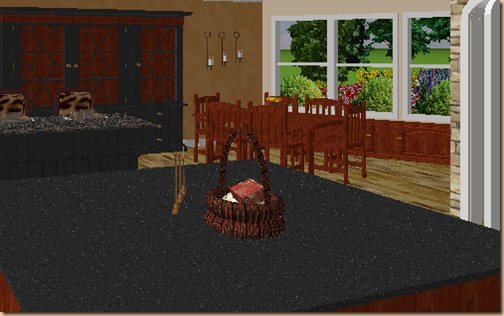
This client is looking at expanding and re-working the garage area as well as completely remodeling her kitchen. (On this post I’m focusing more on her kitchen, however, we’ve done some extensive planning in the garage/exercise/kennel space as well.)
For her kitchen I designed two lay outs – one was working off the architect’s original lay out and another to show her some options within those parameters. This is just one of the options I designed for her. FYI: It has nothing to do with cabinet and countertop details at this point. It’s strictly for the lay out.
Once she decides on the space plan of choice we will hone in on specific details such as cabinet stain and design, countertop options, hardware, window treatments, etc.
This just helps her to see what her options are with regard to laying out the space.
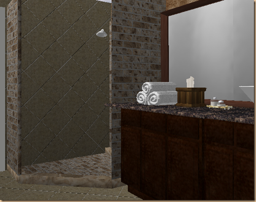
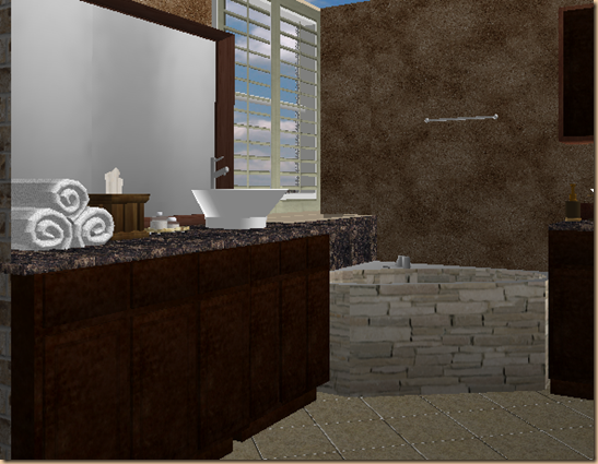
Another of my clients is a young couple looking to update their master bathroom. They were having a really hard time visualizing the addition of stone walls around the shower (the interior shower walls will actually be more elaborate than pictured here), the dark marble countertops with dark stained cabinets……
As well as the stacked stone I proposed for the tub face. And they had no idea what I meant with regard to a faux finish on the walls. They found these CAD renderings extremely helpful in getting the visual perspective they needed.
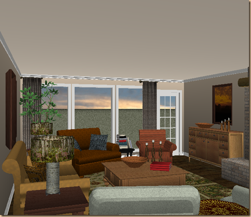
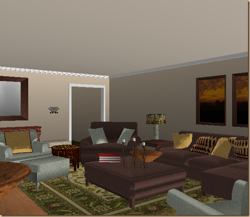
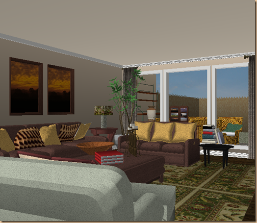
For this family room I wanted to show my client several different lay outs with some different pieces to find out which she preferred visually and what was the best fit for her family. (Again this has nothing to do with details such as fabrics and chair style…..just the lay out itself.) This rendering shows her space with a sofa and four chairs….
This rendering shows the same space with a sectional and ottoman table (yes in reality we’d need a tray under those accessories!) instead of the fourth chair and wood table…..
And finally, here you see a sofa and loveseat….(Notice I popped in the patio for a cozier visual here ![]() )…….
)…….
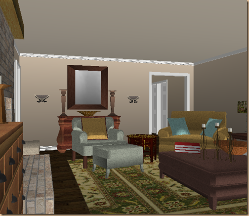
And for another perspective in the space this rendering shows the far wall with a sideboard and mirror……
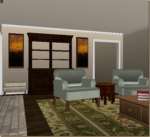
And this one shows the same wall with book shelves and an ottoman on either side that can be pulled into the family room for more seating if needed. (The bookshelves I’m looking at for the space actually has the gliding ladder attached which is really cool looking. I’ll let you know what we decide!)
When remodeling or redecorating – the better visual and understanding you have of the project and end result – the more likely you’ll make wiser choices along the way and be truly happy with the final outcome.
(This is a feature I offer online by the way if you should find yourself needing any design help from a distance. Please feel free to contact me on my contact page if you’re interested.![]() )
)
Happy Decorating!
