This is phase 1 of a project that I’ve been working on for two years. This phase was actually completed months ago, but I’m just now getting around to posting it. This client lucked into a great little house right on the lake in Fort Worth. Great location and great view, but the house itself….well…not so much.
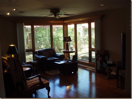
Although it sufficed for awhile there came the time he was ready to update and make the interior view as beautiful as the exterior view.
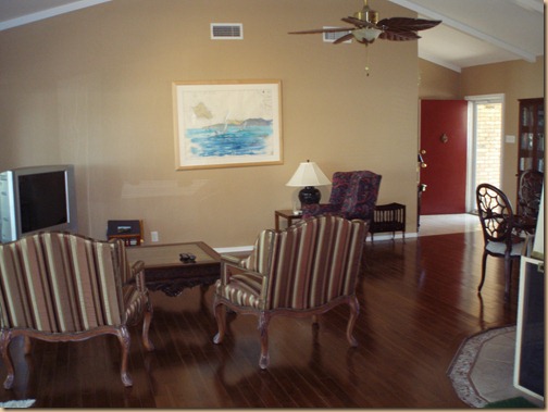
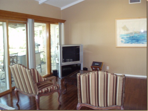
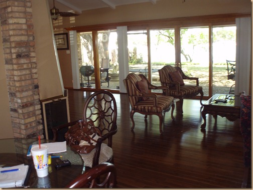
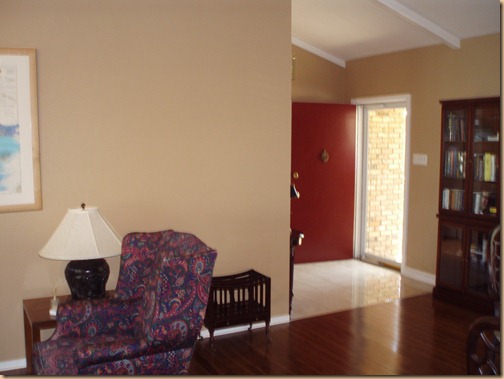
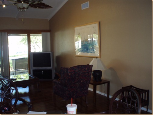
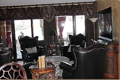
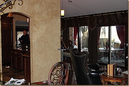
You can see that not much had been done in the way of decorating and cozying up the place, but the spectacular view made it worthwhile.
(These chairs above are actually very nice and I ended up moving those to his office.)
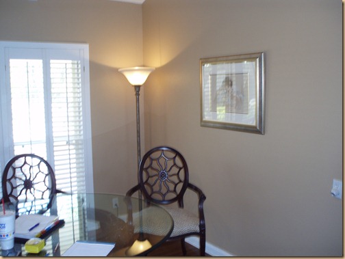
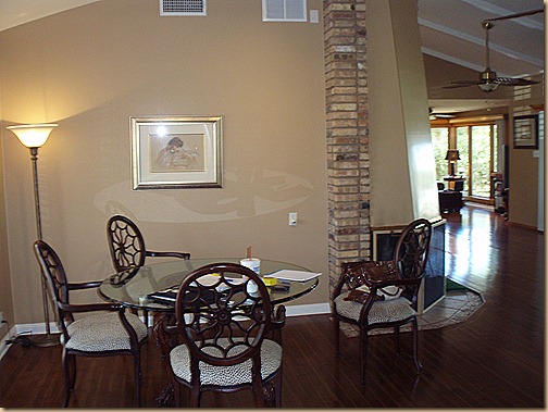
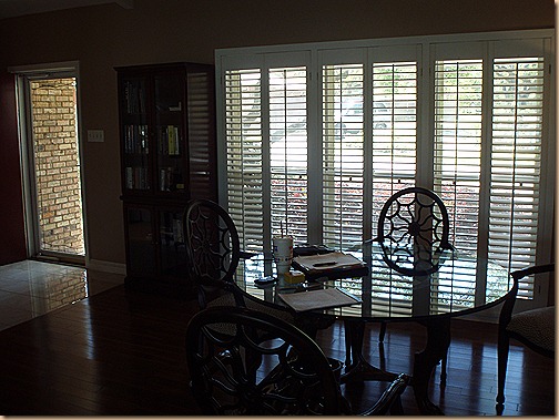
Bland dining area, but great table and chairs. I wanted to keep them, too.
Ho hum…..
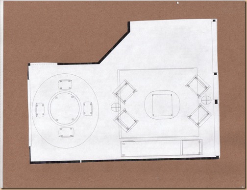
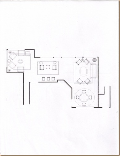
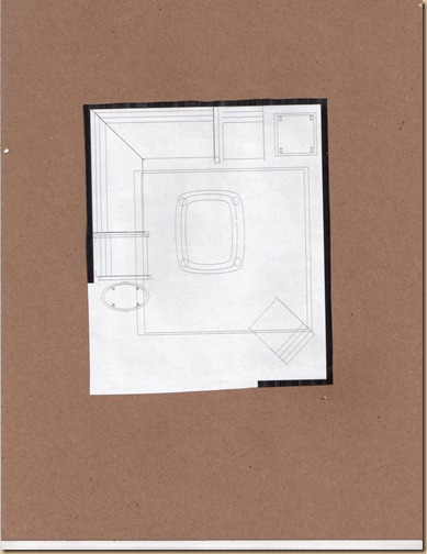
So after meeting with the client, doing the walk through, snapping some pictures and taking lots of notes I went back to my office and got to work. I did a color board, put together a notebook of drawings, colors and pictures and drew up several space plan options one of which is below…..
Just one of the space plan options for the entire area….there were actually several possibilities depending on his needs and preference.
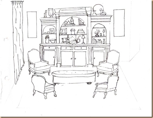
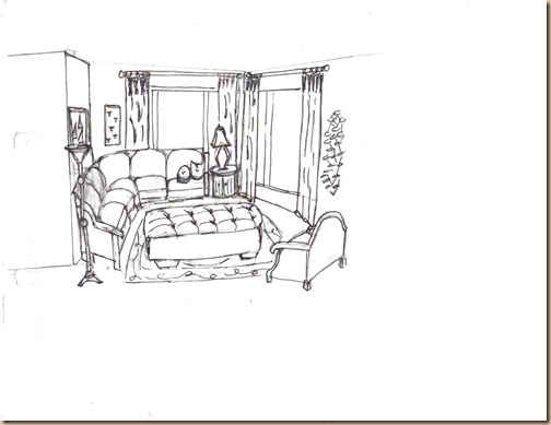
I sketched up a little drawing for a visual in the formal living room…..
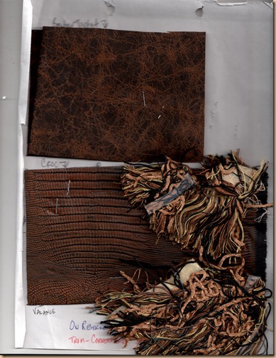
Showed him several fabric combo’s for the drapes. He selected this combination above for both living areas.
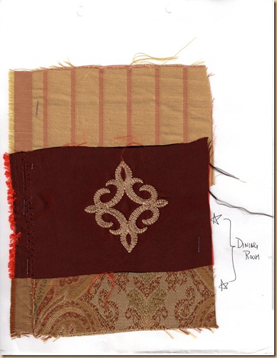
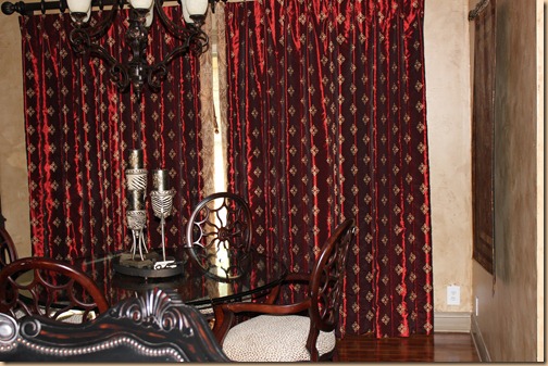
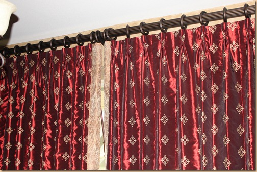
We selected these fabrics for the dining room.
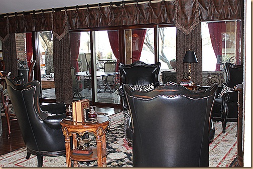
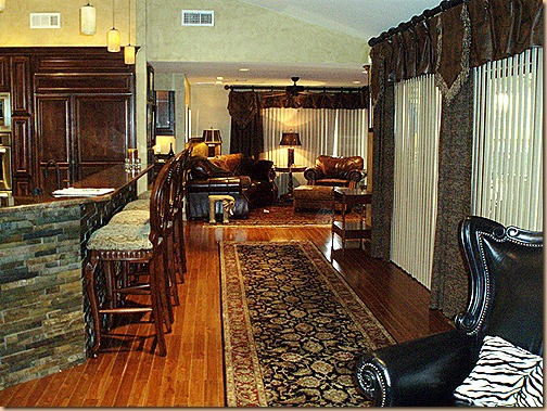
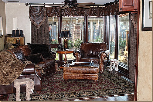
And here is the dramatic transformation. The formal living after.
A bit more charming and cozy I think, don’t you?
This dining room is right off the formal living so I thought I’d include it in the post as well. These are the before pic’s here.
It went from bland…
To grand!
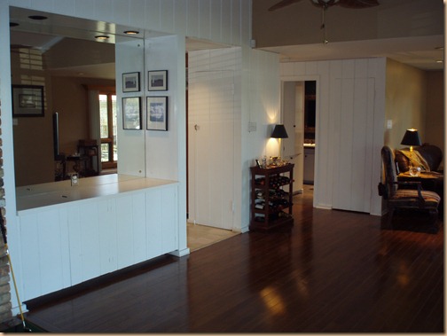
Below is the pass through area to the TV room before we gutted the kitchen and completely remodeled it.
Before…
And after. Pretty dramatic, right?
The pass through area leads you to the next living area. His small TV room.
Again…not so cozified and a bit bland. It’s a tight space, but potentially very functional and cozy….
There were several options here, too, but my preference was a sectional because of the small area we had to work with….
Which I sketched out…again to give him a bit of a visual. But, he decided he wasn’t a “sectional” type of guy so we compromised and got the curved sofa, pictured below. We had a custom TV cabinet built in the right corner for easy TV viewing. Now it’s cozy and functional.
Again – from bland to grand!
A fun transformation don’t you think? Now we’re discussing doing Phase 2 on the other side of the house where we will re-do the master bedroom and the guest room. Still in the throws of planning and decision making. It will be fun to see the outcome of that as well. I’ll keep you “posted” (pun intended!) on the project.
Happy Decorating!
