The best thing about my job is seeing the amazing transformation in a particular space from beginning to end. Well, that and working with wonderful clients like my client, Griffin. Griffin has been one the most enjoyable clients I’ve ever worked with: Fun, funny, great taste, willingness to think outside the box and best of all – willing to put his trust in me. He has a great little gated lake home with a large front yard and an amazing view of the lake that you can see from the circular drive the minute you pull up to the house. The dining room windows are uncovered during the day so you can see through the dining room and out the wall of windows across the back of the house. It’s breathtaking! (You immediately just want to wander out back, plop down on a chaise and sip on a glass of wine.)
This amazing view is the reason he purchased the home in the first place and it is, understandably, of the utmost importance to Griffin. He knew when he moved in that some day he wanted to change his cramped little dated kitchen into something more modern that would enable him to see the lake from anywhere he stood. In addition to this requirement he desperately needed it to be more functional. After interviewing different contractors he chose Chris, with Archistructure. (If you have read any of my previous posts his name will be familiar.) So after my initial design plans were drawn up the three of us began to work together on the final design. We planned and tweaked ….and planned some more. Then we tweaked and tweaked and tweaked till we created a space that was both functional and beautiful encompassing everything Griffin wanted. He now has an updated, highly functional, not to mention gorgeous space. And best of all he has a lake view from every spot in the kitchen! Here are the “Before and After” pictures:
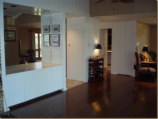
BEFORE: This is the original view of the kitchen entrance from the pass through area. The pass through was big enough for a small bowling alley! Lots of wasted space, but it gave us plenty of room to work with in expanding the kitchen.
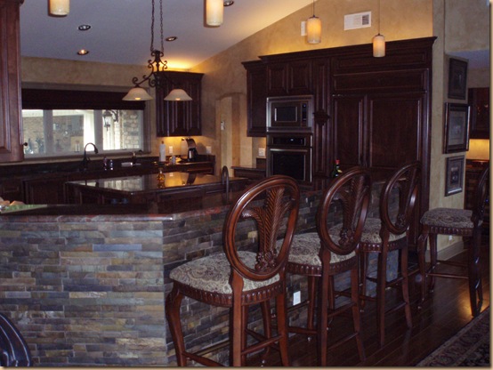
AFTER: We removed the entire wall, raised the ceiling and the same space above now looks like this! We used stacked slate for the face of the bar, hung blown glass pendants from the vaulted ceiling and added four bar stools. Perfect for entertaining. The stacked slate bar front is durable, stunning and compliments the granite perfectly.
BEFORE: This view is of the front left corner of the kitchen facing the front yard. You can see how tiny, cramped and unappealing it is.
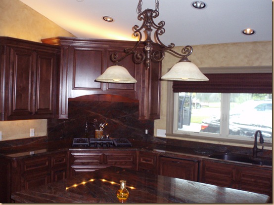
AFTER: This same corner now looks like this. A corner cook top with a granite backsplash. Notice the raised ceiling, added canned lighting and cool light fixture, too!
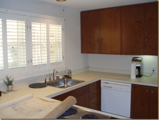
BEFORE: The opposite corner of the kitchen had a sink and dishwasher. No personality, no style and no space.
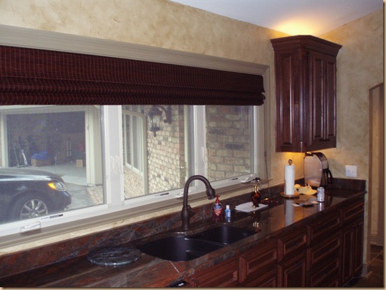
AFTER: We replaced the window with a much larger, crank style window. We centered the sink on the new granite countertop. And to the far right (you can barely see it) what was once a dishwasher is now a doorway leading out to the hall for much easier access to and from the kitchen from Griffin’s office and side entrance. We replaced the shutters with these rich, cherry woven woods.
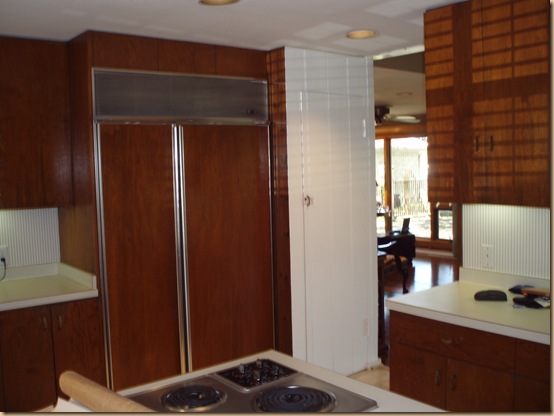
BEFORE: The original fridge and counter space. Again, not much in the way of personality.
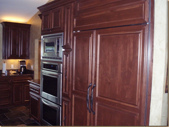
AFTER: Class, character, elegance and space to move and work.
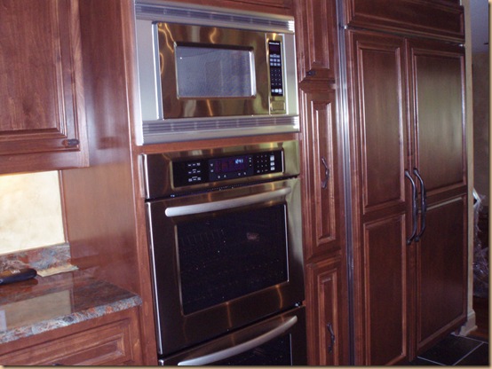
AFTER: Another view of the fridge, oven and microwave.
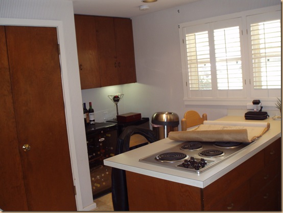
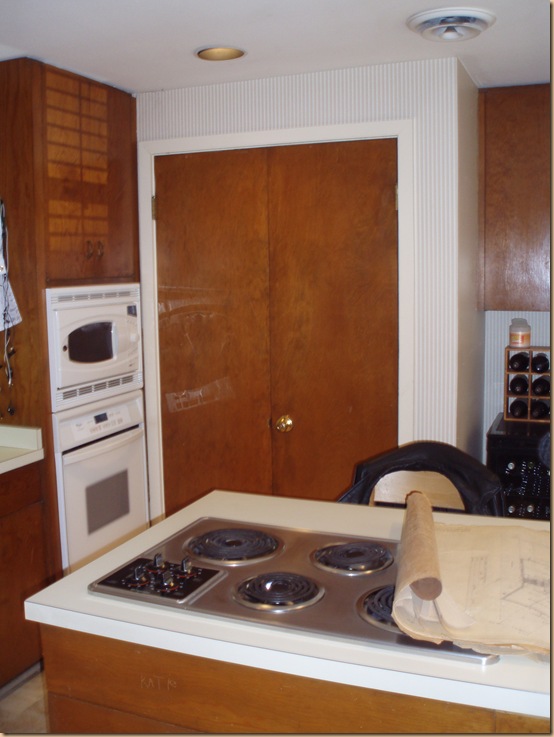
BEFORE: The original kitchen had a peninsula with the stove top sticking out in the middle of the space that hindered mobility.
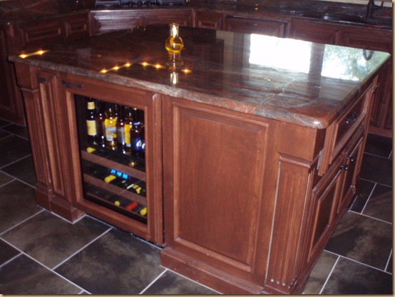
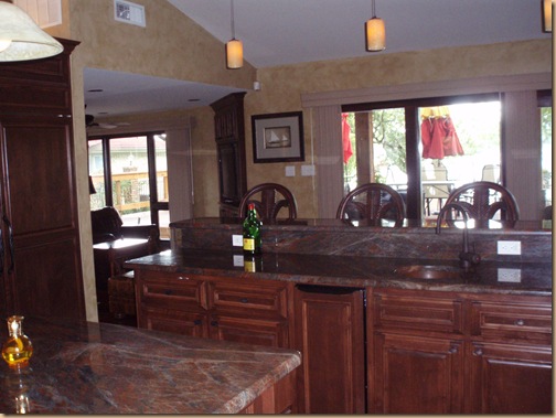
AFTER: The new kitchen has a spacious, functional island with a granite top, wine fridge, warming drawers, cabinets and shelving for plenty of storage. Take a look at the slate look tile floor (we found it on clearance!) in a staggered brick pattern.
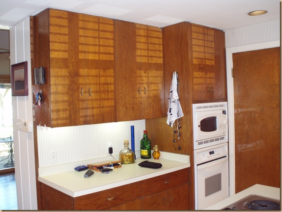
BEFORE: This is the wall of cabinets blocking the view of the lake that had to go. We moved the oven and microwave next to the new fridge and opened up this entire space for a spacious bar.
AFTER: With the removal of the wall he now has an amazing view of the lake and a great place for friends and family to land when entertaining.
As you can see what was once a cramped, uninteresting, dated kitchen with low ceilings (that made you feel as if you were in a cave) is now an open, spacious, updated work space. Griffin has a large family and loves to have holiday parties at his house. Now his kitchen provides the perfect atmosphere…..and the perfect view!
WOW!! What a dramatic change! Love the stone wrapped around the bar counter…
Thanks, Denise!