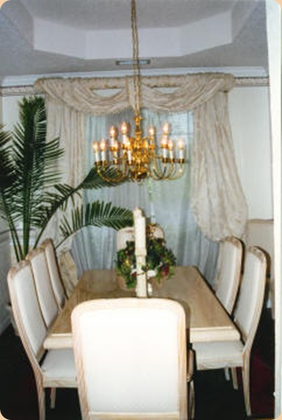
 FLASHBACK: This is my original dining room when we moved into this house 17 years ago. I decided to keep a neutral creamy palette with the only color coming through in the wallpaper border and in the rug. This was back in the day of hunter green, burgundy and navy blue. Remember that? But, I wanted tone on tone cream striped wallpaper – just in case one day I wanted to re-do drapes and chair cushions. (How ‘bout that hideous builder grade chandelier???)
I was happy with the space and hadn’t planned on changing it any time soon at all. But, when the cat we surprised our three year old daughter with for her birthday to our horror decided to use the puddling sheers as his new litter box, we had no choice – they had to be removed. So we were left with the panels and the valance, which allowed more sunlight into the room we told ourselves, so all was still well. I guess when he, Ashes was his name, discovered the sheers were gone he decided the drapes worked just as well and started doing his “business” on the drapery puddling on the floor. Once our noses eventually lead us back to the crime scene, and after frantically trying to get them cleaned to no avail, I ended up chopping off the beautiful puddling and leaving them floor length. They still looked okay, I decided, and well, it was easier to clean the floor without the puddling drapes after all, so it still worked just fine. But, that didn’t stop our little Ashes from eventually scurrying up the panels and making a mess of them, too. So down they came. In the end all that was left was the pathetic little swag across the top. Luckily he couldn’t get to them and as ridiculous as they looked I left them there for quite some time, all alone at the top of the window, until I could figure out what I wanted to do and could set aside the money to re-do another set of custom drapes. Sidenote: After this (and many more cat horror stories) we discovered we’re not “cat people” so when he went to kitty-cat heaven we swore we’d never have another one. (Sorry cat lovers….I know they’re wonderful….. .just not for us!)
After some considerable time I saved up enough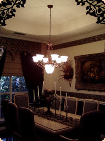 money to change my look and decided on blacks and tans. I had a scalloped cornice made to dress up a mock roman shade and black silk drapery panels. I glued on some black beaded trim to the shade after they were hung to dress them up a bit. (Hint: This saves on labor costs, too!) And, since I had the forethought to go with cream wallpaper originally I was able to keep it and just re-do the border. I found this perfect-for-my-space black border at Sherwin Williams. Since wallpaper stores are so few and far between these days I discovered they have a nice selection of wallpaper books and can order samples for you to take home. I finally replaced the hideous chandelier with one that had a bit more personality and I had the dining room chairs recovered using coordinating fabrics to compliment the drapes. I used a stripe for the front, repeated the damask for the back and used the same beige from the mock roman shade for the seats. The floral sconces were custom made and the oil painting is an original oil I was fortunate enough to find on one of my World Trade Center excursions with some girlfriends. ( They helped me pick it out.) Under the chair rail I decided to give it some "oomph" with textured, paintable wallpaper (again from Sherwin Williams). I painted it black. So even though the basic wallpaper stayed – with all the black and the new fabric, I had a brand new dining room which worked well for a number of years.
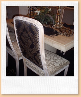 I Used Three Fabrics On Chairs
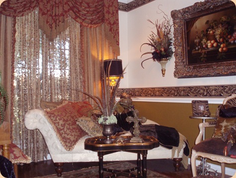
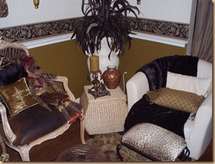
But, of course, as time marches on life has a tendency to change things. As I mentioned under my "About Me" page as my kids have gotten older our family has gotten larger and we began to need a larger dining room. And, like so many people these days, we had less and less need for a formal living room. You know the one – the room that stays pretty, but the room that no one ever sets foot in. Who needs it? Sooooooo…..it was time for a change……again. I decided the best solution for my family was to flip the two rooms. My dining room would be perfect as a smaller "sitting" room. Or what I like to call my "girlie" room. And my larger living room would be perfect for a more accommodating dining room for my growing family. So I had my draperies flip flopped, my lighting flip flopped and the furniture switched. I angled the chaise lounge to create a little interest and painted my wallpaper below the chair rail Sherwin Williams Relic Bronze this time. The cream wallpaper stayed, which was good, since it saved me money. I was going to switch out the wallpaper border again to a red and gold border this time, but decided after pulling some black back into the space with the reds and golds I transferred from the living room that it worked just fine and could stay. I needed two small club chairs to finish out the space since I could no longer use the sofa from the original living room. It was too large and too formal. I wasn’t sure what style chairs I wanted, but couldn’t stand the room looking unfinished so I decided to purchase two very inexpensive "temporary" chairs from "IKEA" until I could figure out exactly what I wanted. They were a perfect fit and a perfect style. (I may just keep them and have them recovered!) Now that I’ve flipped the rooms both are used frequently. I spend a lot of time in my "girlie" room reading, napping and listening to music. And my dining room is much more accommodating and roomy for my growing family. I just wish I’d thought of it sooner!
My Cozy "Girlie" Room — A Quiet Space Of My Own
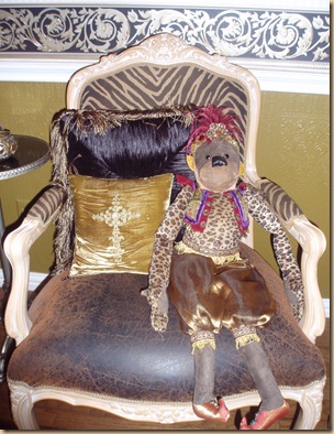
Like My Little Monkey? I Think He Belongs In This Space!
My “Temporary” IKEA Chair
My Scrumptious Chaise Lounge
LOVE the girly format! It’s so cozy 🙂
I love your sitting room. It’s so warm and cozy can’t quit looking at all your pictures. Such great ideas.