If you’re building a home or thinking about remodeling your bathroom there are a lot of decisions and a lot of thought that goes into it. Sometimes you just want to do something basic and inexpensive, but other times you want to really rev it up a notch and come up with something that’s got a bit of that “wow” factor. You know…give it some snazz and pizzazz. And, in case you didn’t know what the definition of pizzazz is, well, it’s “an attractive combination of vitality and glamour”.
Now who doesn’t want a little vitality and glamour?!
Today I’ve got pictures of ten different bathrooms that are full of ideas for you to consider. They are all completely different in style and color so of course it comes down to your own personal taste, but maybe these will help jumpstart you in the right direction.
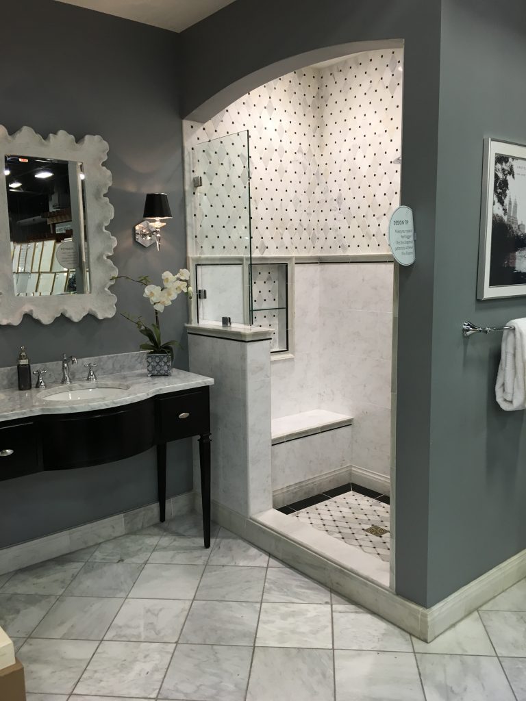
If you’re a fan of gray and marble and light and airy spaces…..and lets face it….who isn’t these days….then this bathroom might be a source of inspiration for you. This dark gray wall is a gorgeous contrast to all this light gray marble. Notice they’ve used a combination of tile sizes, shapes and designs to create this interesting, charming vignette. The back of the niche reflects the floor and the upper wall tile and brings some pattern and color to the mix. The shower pan has a black band around the perimeter which gives it pop and definition.
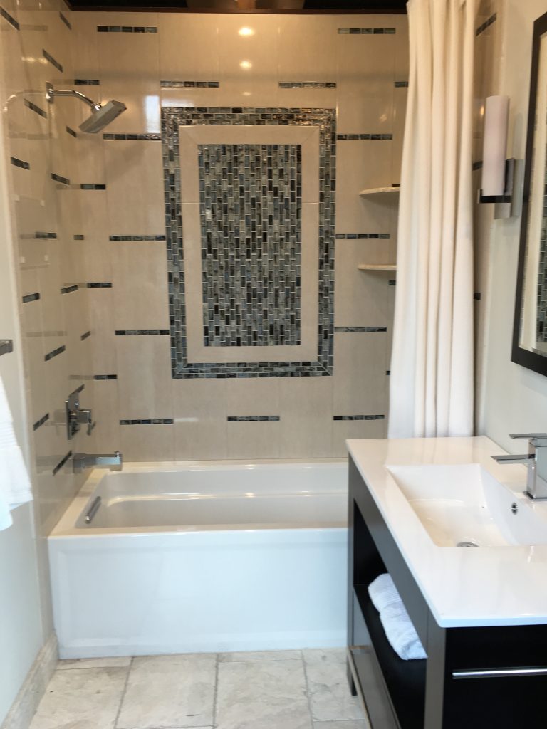
In order to give an otherwise vanilla shower surround some pizzazz here they’ve used glass tiles in a picture frame design on the back wall. These colorful vertical lines of tile you see throughout are just the same glass tiles that have been cut into strips and placed above and below each large rectangular tile. This is a way to add some snazz without spending an exorbitant amount of money. These tiles come on a 12×12 mesh sheet so cutting away a 1×12 inch strip like this means that it goes a long way. Think about it – just one sheet will give you twelve strips so it wouldn’t take a lot to create this look.
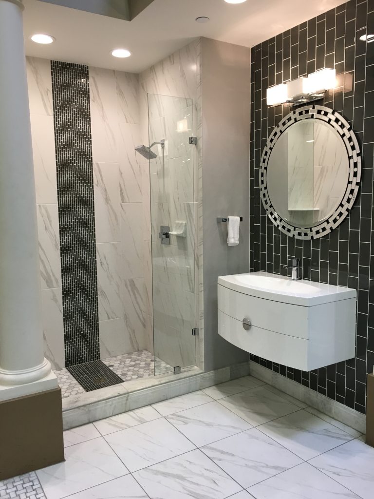
In this vignette the black vertical band running through the center of the shower surround compliments and balances out the glass tile wall. And both of these make an interesting contrast to the white and gray tile. The smaller tile in the shower pan contributes a lot of snazz and pizzaz to the space as well.
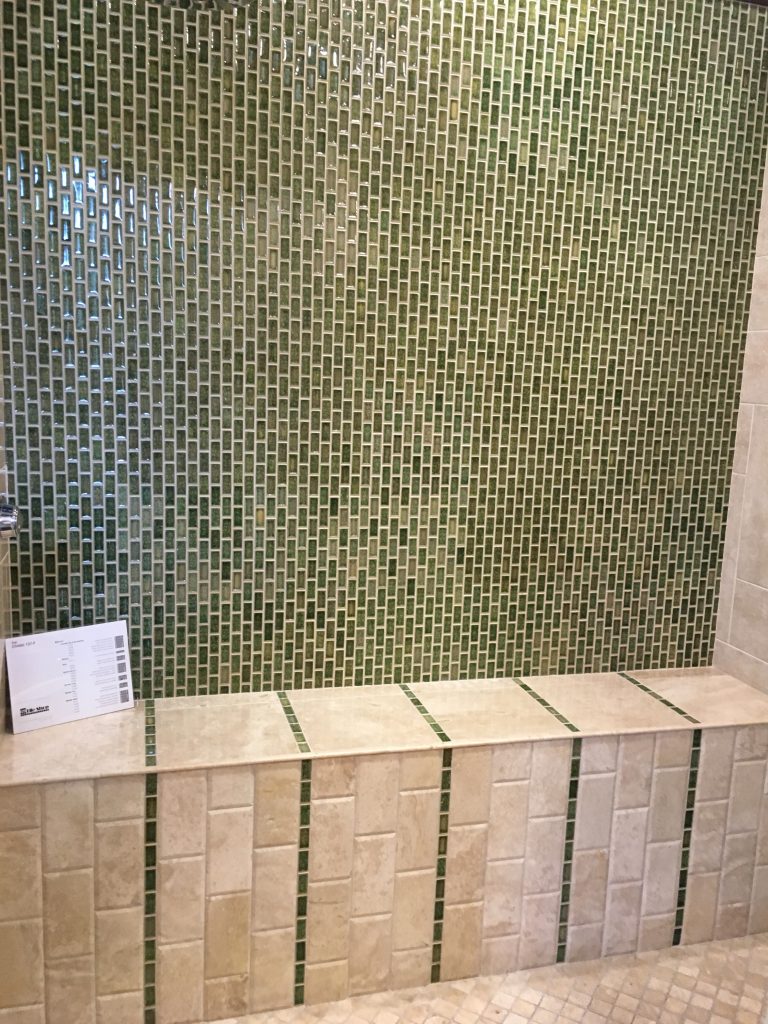
If you have it in your budget and you really want to play up the back wall choosing a glass mosaic tile like this really revs things up a notch. In this shower notice all the tiles are placed vertically – the glass tiles as well as the 3×6 marble subway tiles. Continuing with just one strip every twelve inches or so with this decorative mosaic tile really adds some unexpected glam to the shower bench.
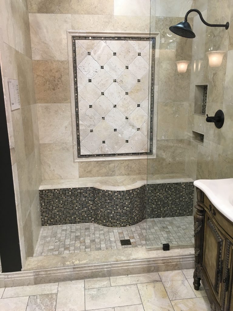
In this bathroom they’ve added quite a few details that create interest and drama. The dark glass mosaic against the travertine is a stunning contrast. They’ve repeated it in the skirt on the bench and in the picture frame molding on the back wall. They’ve inserted small pieces of it where the corners of the inset diagonal tiles meet. This is another great way to get your expensive mosaics to go a long way. Clipping them to a 1×1 or 2×2 square will enable you to get a lot of bang for your buck. The interesting shape on this bench lends drama and interest as does the transition of the Versailles pattern on the floor to the smaller 2×2 tumbled marble on the shower pan. Using different sizes, shapes and finishes of the same product help give the space depth and interest.
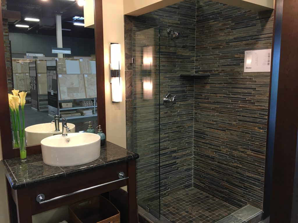
This linear slate tile has enormous impact on a space and doing the entire shower in it really makes a statement. The darker color is rich and masculine.
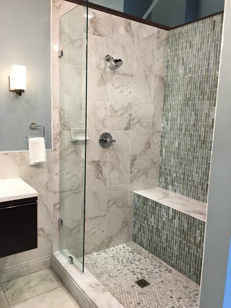
Again here they’ve used a combination of interesting shapes and mixed the marble with the glass tiles. The 12×24 marble tile installed vertically on the shower is repeated horizontally on the floor. The dot in the shower pan makes a striking contribution and the darker glass tile, also installed vertically, give the shower a touch of sophistication and glam.
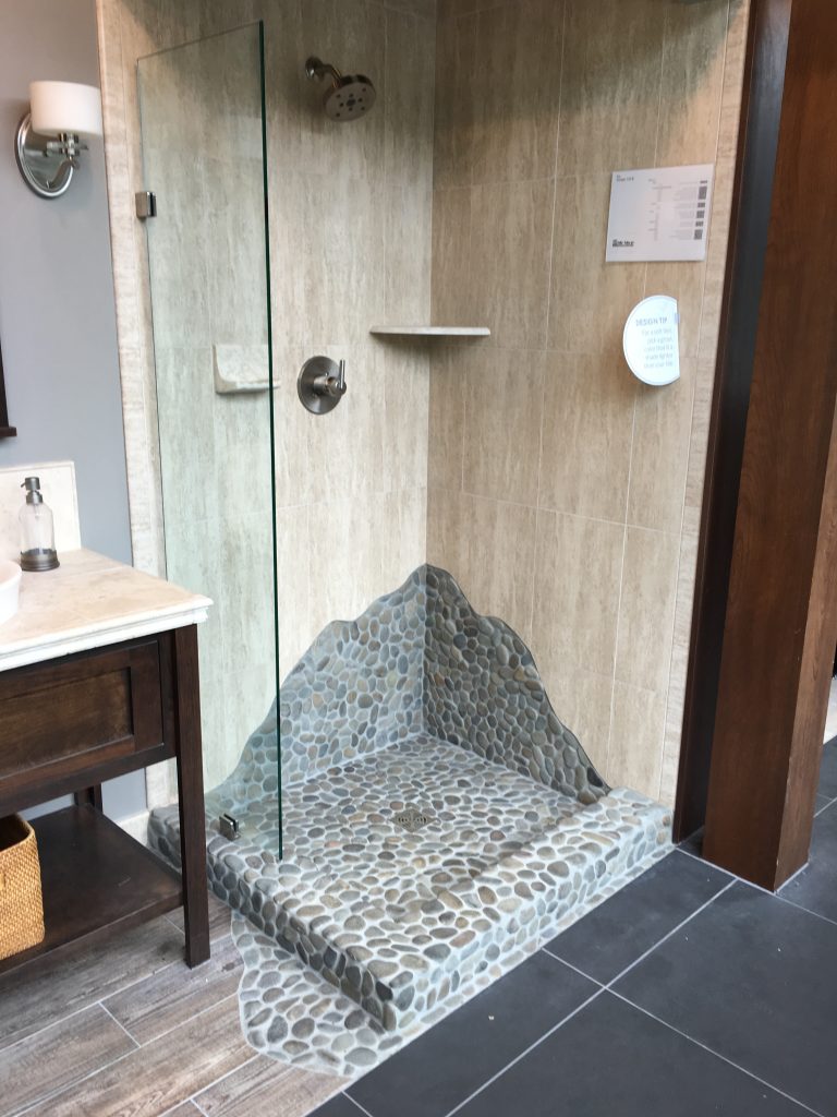
In this shower it’s the bottom of the shower that makes the statement, but it makes a big one. The unexpected shape as it climbs up on the wall and the way is spills out onto the floor is fun, unexpected and interesting. Completely adds personality to an otherwise insignificant shower surround.
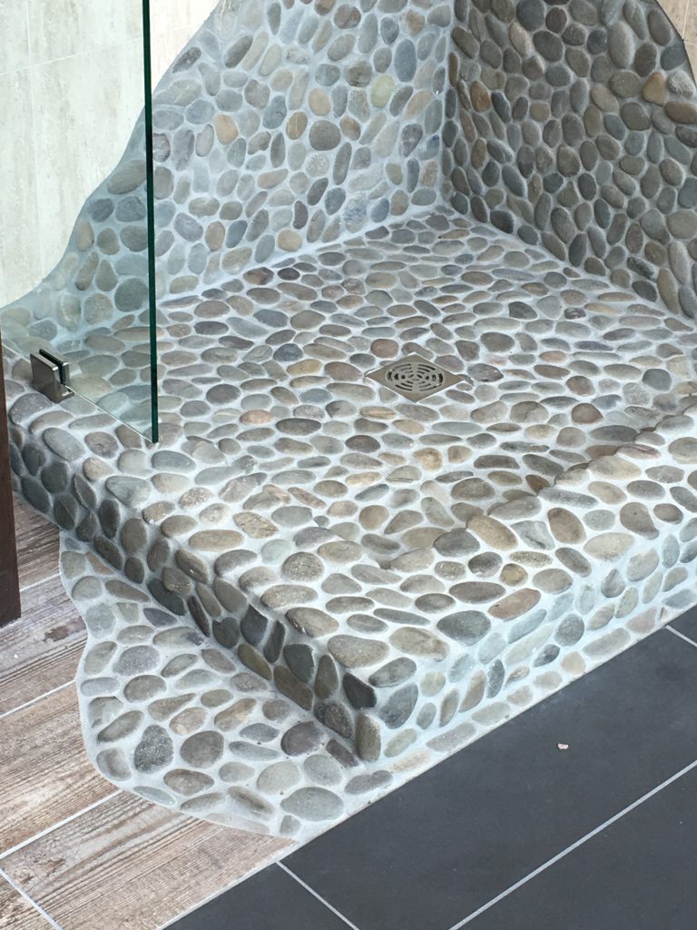
Here it is close up. It’s cool, isn’t it?
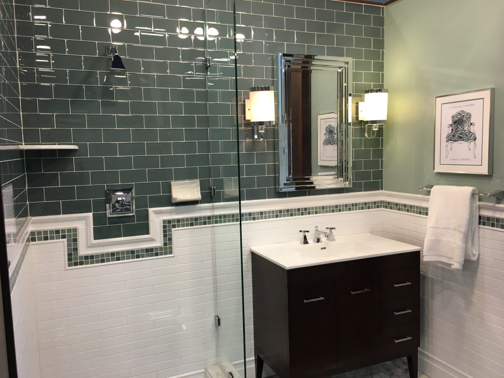
There’s so much fun detail in this bathroom vignette. This green tile mosaic band running through the white subway tile really adds a charming design detail complimenting and playing off the green subway tiles on the wall. I like the way this cut out around the fixture adds to the design and I like the soft subtle green paint on the wall. This white and green color combination is fresh and fun.
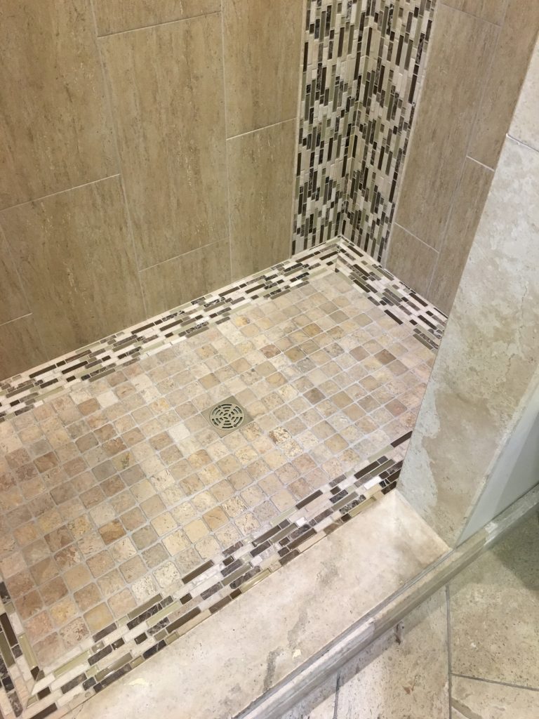
And last, but not least, a great way to make a statement is the simply do horizontal and vertical banding like this. See how it jumps out at you against this beige marble? It’s less expensive than doing an entire wall in it, but just adding it around the perimeter of the shower pan and running it up vertically in the corners like they did here has a huge impact and the end result is a shower with snazz and pizzazz.
So if that’s what you’re looking for…..some snazz and pizzazz in your own bathroom – I hope these bathroom vignettes help you to get a little focus and give you some ideas on what direction you might want to go.